Problem Definition
Monito is a website that helps people living abroad find the best financial and digital products for their needs. The core of Monito is international money transfer comparison, followed by Neobanks, VPNs, Language apps, Travel Insurance and more.
The problem: Over 93% of Monito.com users visited only once. They'd compare international money transfer options, choose the cheapest provider at that moment, and never return to check if there's a better option next time.
The money transfer comparison product was already mature from a UX perspective thanks to Jackie Hunter, a senior UX designer. The low retention came from the nature of the product itself - users visit, get a recommendation, switch providers, and don't return unless they're unhappy. From our email alerts, we found it takes around $25 in savings to convince someone to switch providers again.
Core Challenge: How might we transform a one-time comparison into a stickier product that helps expats save money consistently and discover relevant financial services for their journey abroad?
Research: Understanding User Needs and Demand validation
User Interviews with Monito users
We recruited participants from our website via Typeform and conducted qualitative user research through in-depth interviews with a diverse range of users, from UK teachers to a person living on a cruise ship.
Primary Target group:
We identified our core target user: migrants living abroad who support their families back home and
want to stay connected while starting a new life in a new country. This group was chosen
because Monito's mission is to help people starting new lives abroad.
Key Findings:
- Personalized Comparisons: Users wanted to tell the system which providers they already have accounts with so the comparison would show true prices, not just promotional rates for new customers
- Offline Currency Converter: Users needed a currency conversion tool for rough estimates when shopping abroad, since the website works only online
- Community Support: Users talked about how important it was to have support from people with the same cultural background when starting life abroad - someone who understands, shows next steps, and makes it feel a bit like home
Fake-Door Test for Initial Validation
We placed a "Download Our App" banner in the website header, leading to a Typeform waitlist to measure user demand without upfront development investment.
Result: 12% click-through rate validated strong user demand for a mobile app, giving us confidence to invest in development.
"Download app" fake-door test banner
Ideation: Shaping ideas from findings
Initial Concept Development
I developed multiple concept designs addressing needs for individuals abroad, including community-building features and a "dashboard" integrating information relevant to users' new and original countries.
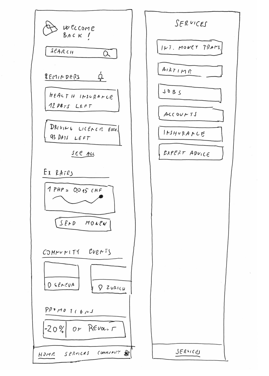
Early sketches and concept designs
Learning from Failed Social Feature Concept
Initial interviews indicated users wanted to connect with people from their home country. However, deeper interviews revealed this need appeared very differently for each person:
- Gender differences in connection preferences
- Nationality-specific cultural needs
- Requirement for hyper-local proximity we couldn't deliver
- Vastly different expectations for who to connect with, how, and desired outcomes
Pivot Decision: We abandoned the social connection feature and instead decided to provide tailored local guides created by people with shared backgrounds (e.g., Indian guide for Indians living in the USA) to partially address user needs without the complexity of peer-to-peer connections.
Design: MVP and Product Evolution
MVP Strategy: Starting with Core Strength
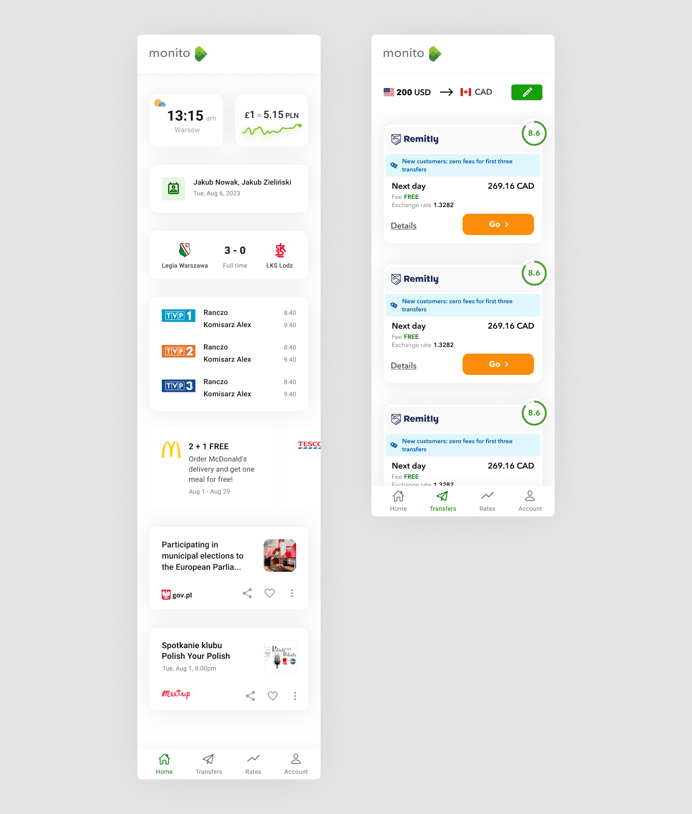
For the MVP, we started with our core product: International Money Transfer (IMT) Comparison, optimizing the existing mobile web experience into an app. Since the money transfer product was already mature from a UX perspective, we focused on adapting it for mobile app instead of reinventing it.
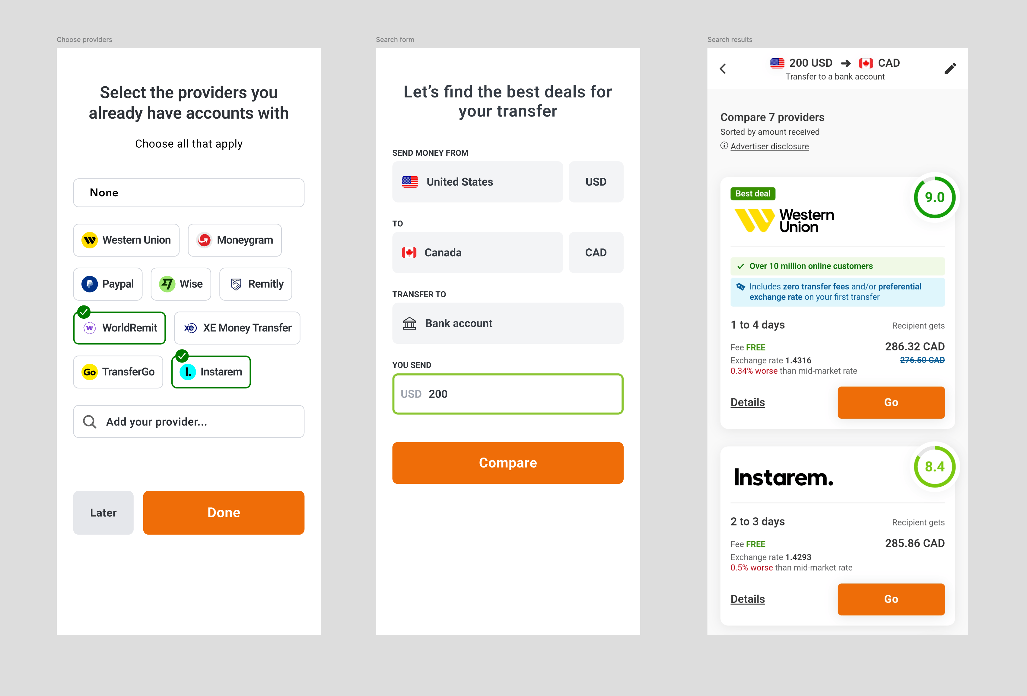
We also added onboarding and a screen for selecting providers that the user already has to cover the need that came up from user interviews.
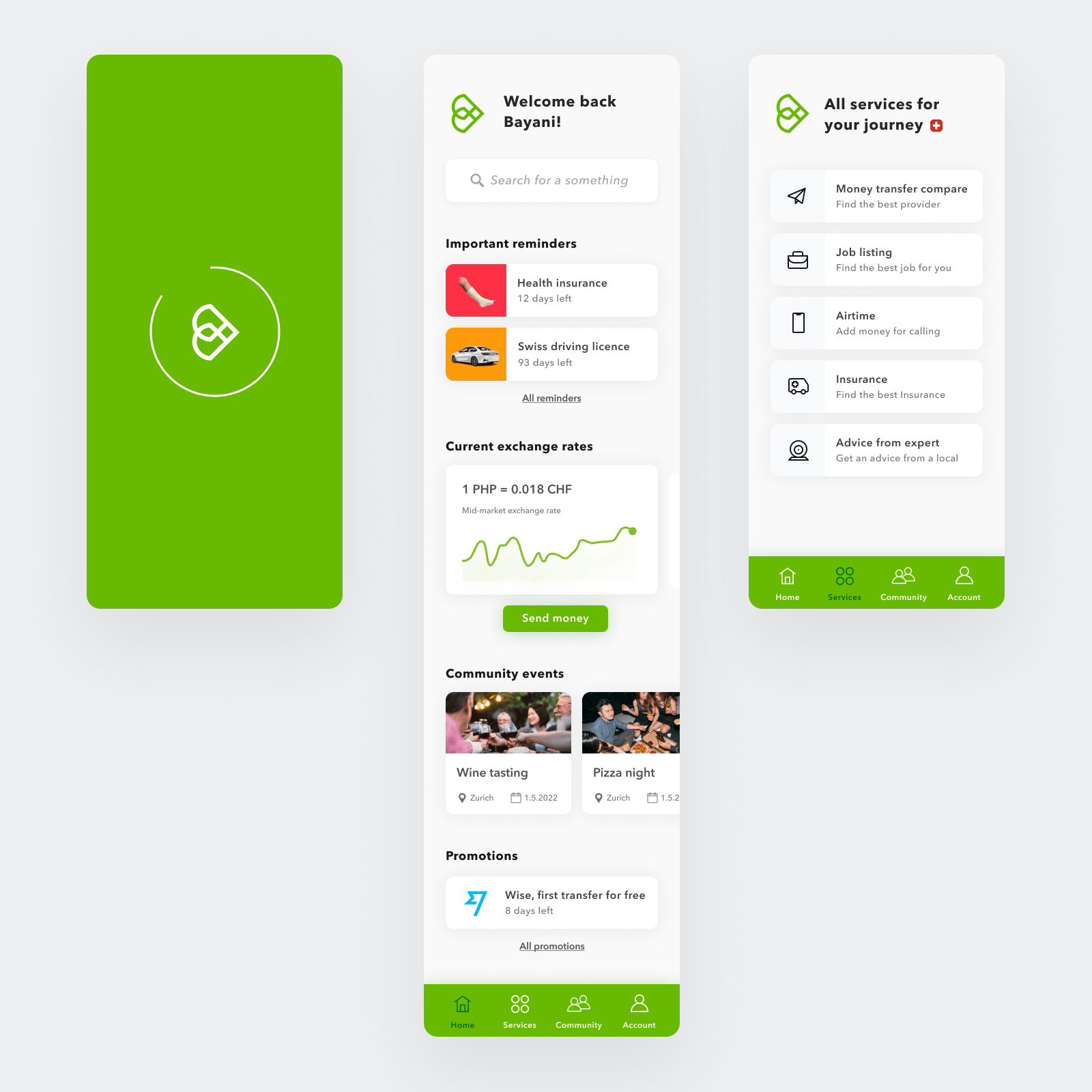
Initial MVP screen flow
SVG Animations
I prepared SVG animations for Welcome screens and Onboarding to give users more context about the app and why the app will request certain actions in next steps.


Animated Welcome screen and Onboarding illustrations
Optimized Design System for App
Built a design system based on our existing web system with app-specific adaptations:
- Ergonomic Modal Redesign: Converted desktop modals to bottom drawers for better thumb accessibility
- Touch-Friendly Components: Increased touch targets and improved mobile interaction patterns
- Consistent Visual Language: Maintained brand recognition while optimizing for app context
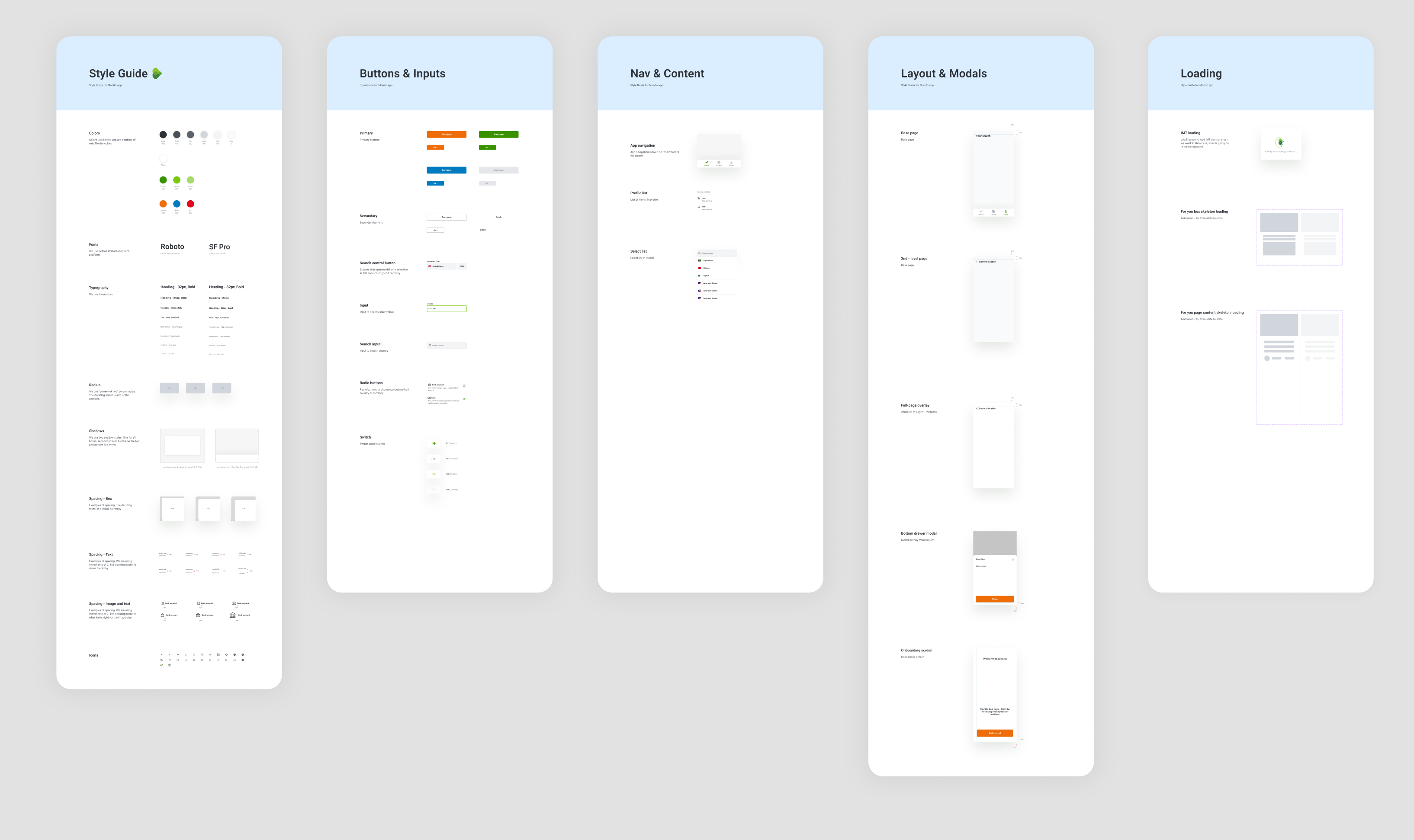
Design system for the app
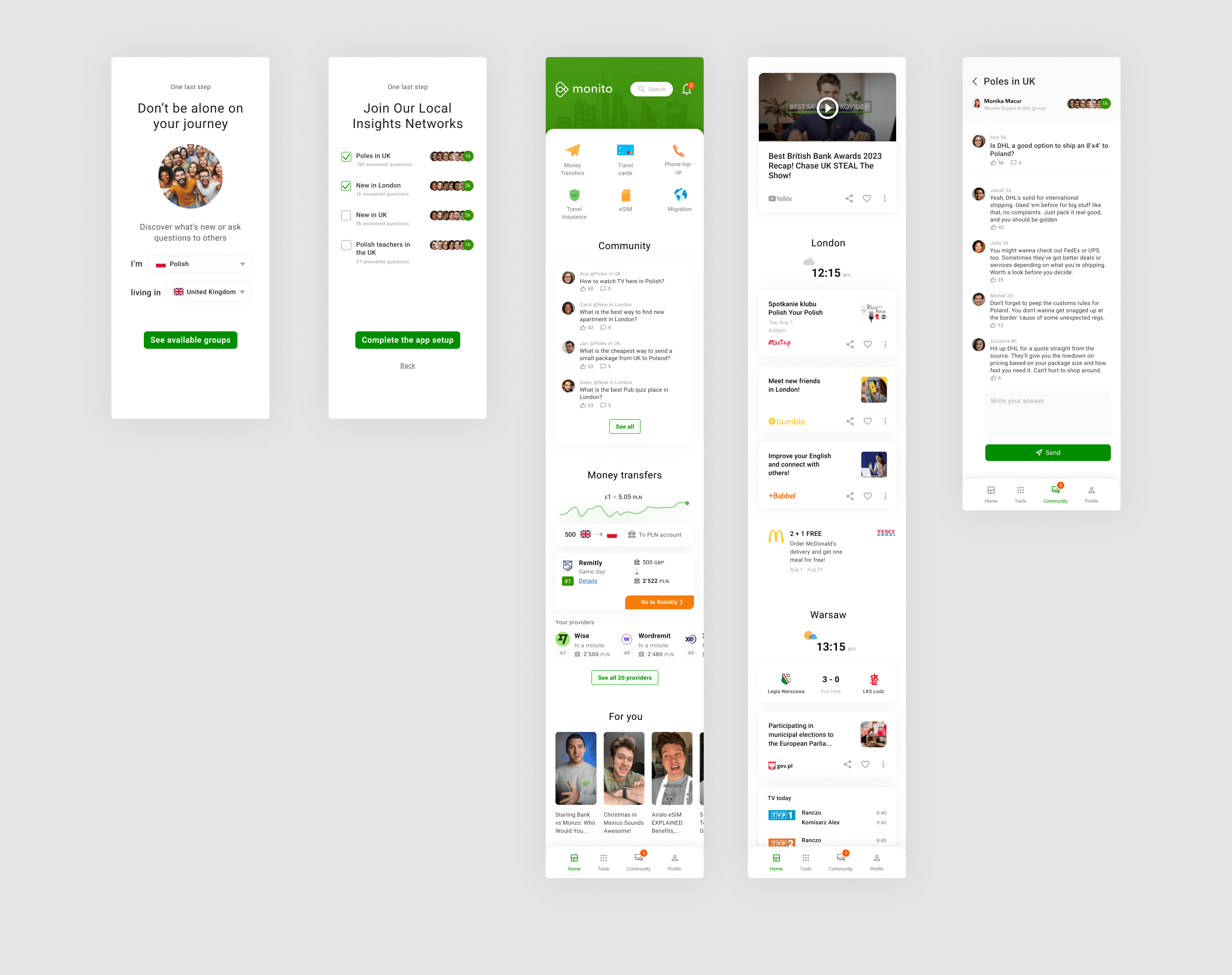
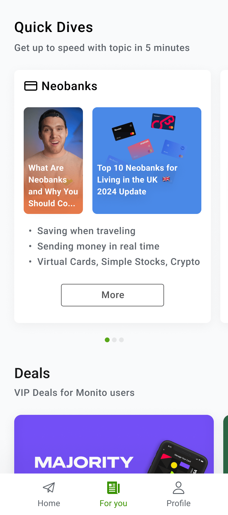
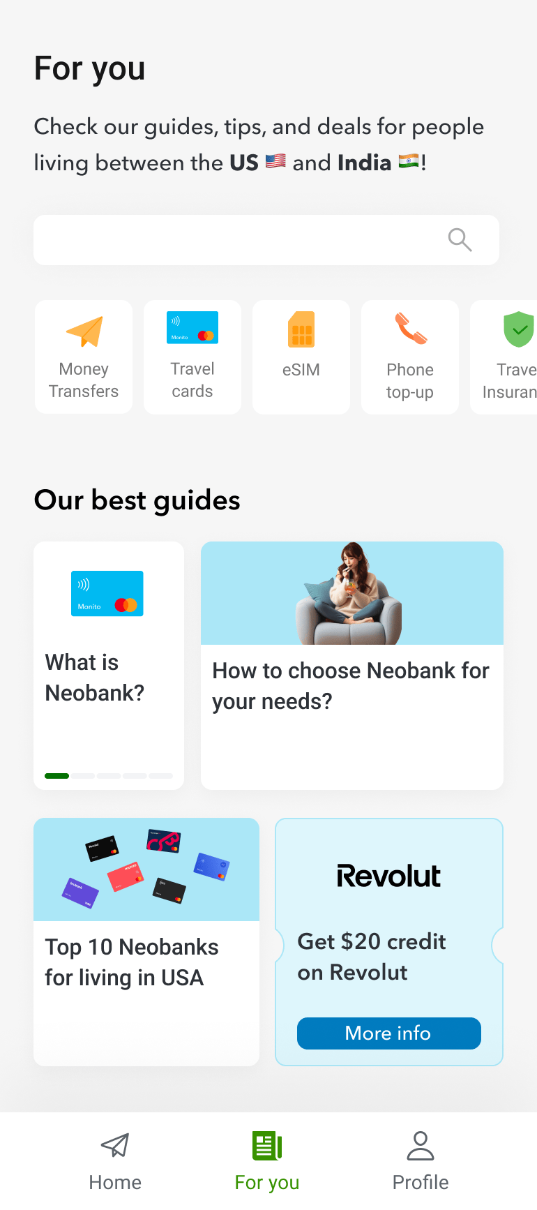
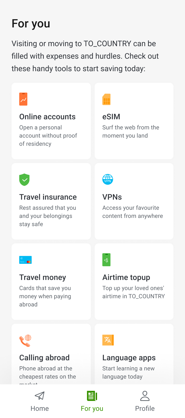
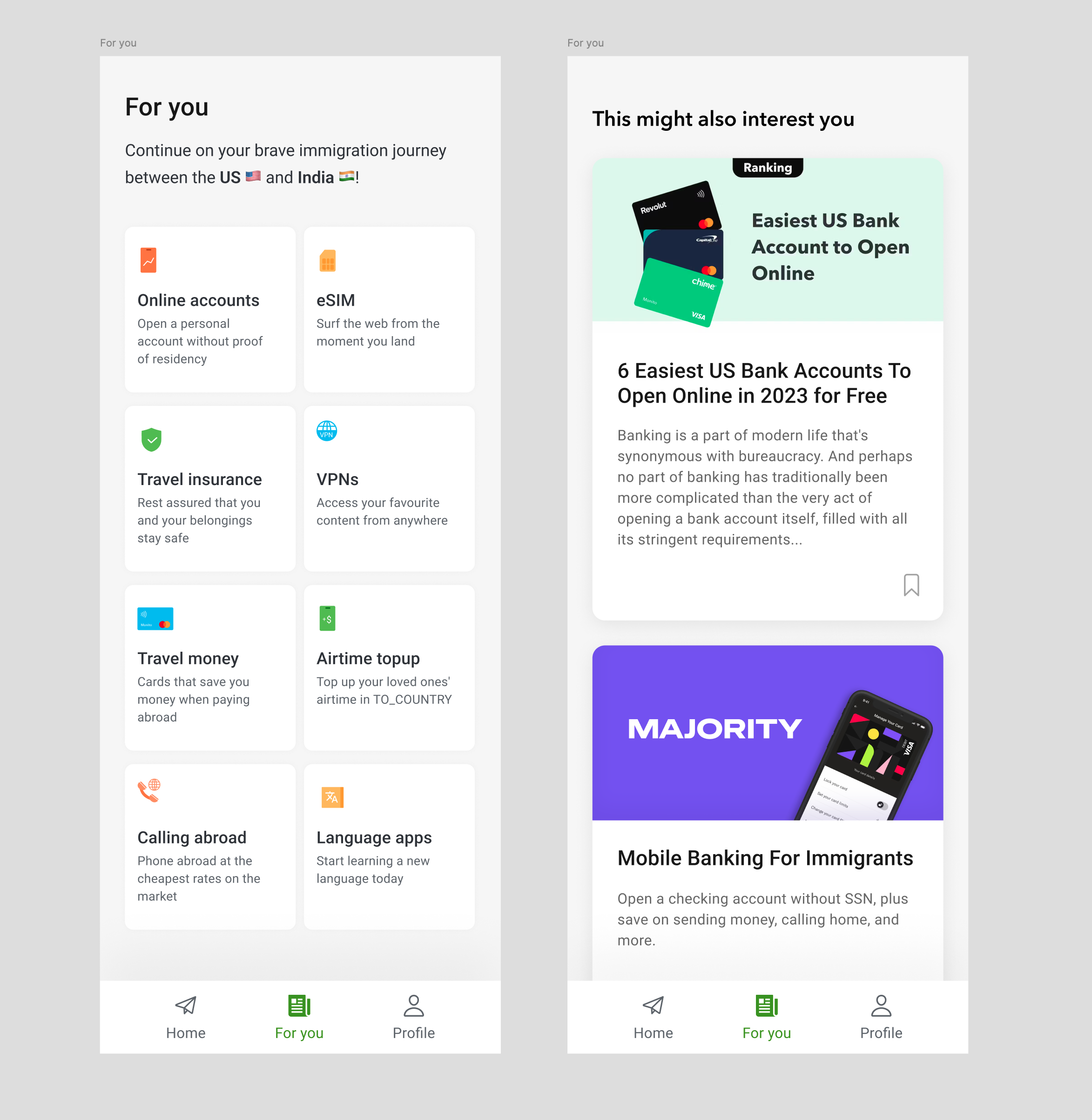
New For You page with Vertical Grid
The MVP delivered on two key user needs: users could select providers they already had accounts with, and they had an offline converter. Business metrics showed people came back weekly, notifications helped engagement, and paid marketing started to be profitable.
Next, we wanted to grow performance by converting users across multiple verticals. Early concepts included checklists for tasks like changing driving licenses, getting social security numbers, opening bank accounts, plus other products like travel insurance, visitor insurance, or VPNs to watch shows from home.
Why Vertical Grid Over Alternatives:
We tested three concept variations including bento box designs to bundle tools and content. The vertical
grid won because it was the most cost-effective to develop while still showcasing products customized for
users' specific needs based on their origin and current country.
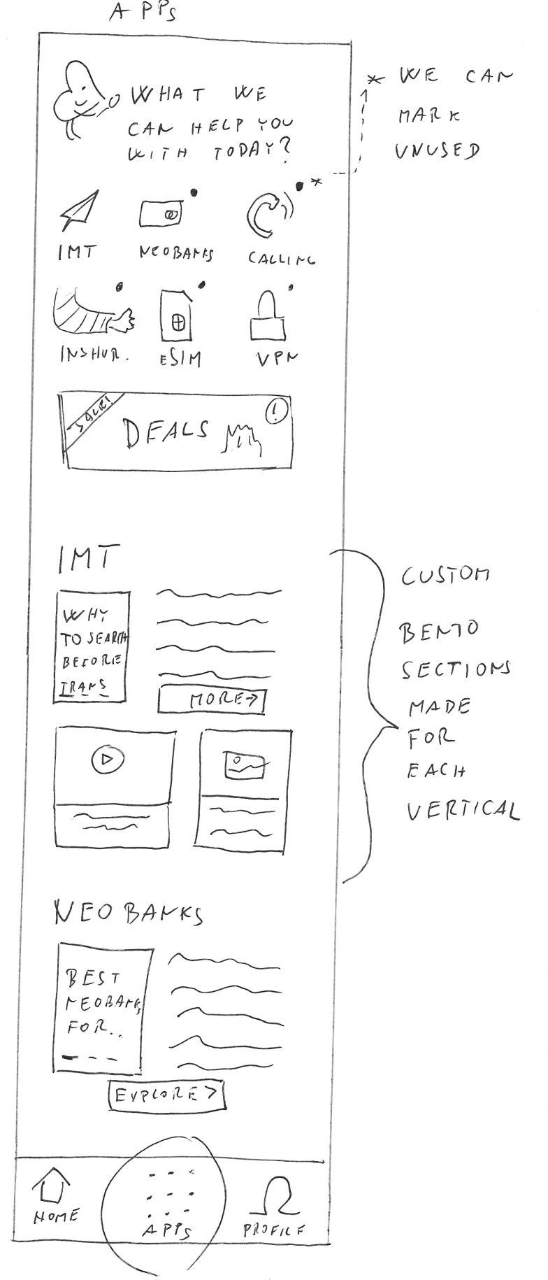
Concept designs leading to the MVP
Custom Icon System for Enhanced Clarity
To make the simple list of verticals feel more alive and useful, I created a custom icon set with design system colors as SVGs. These icons helped users quickly identify different financial products and added visual appeal.
Custom icons created for the vertical grid
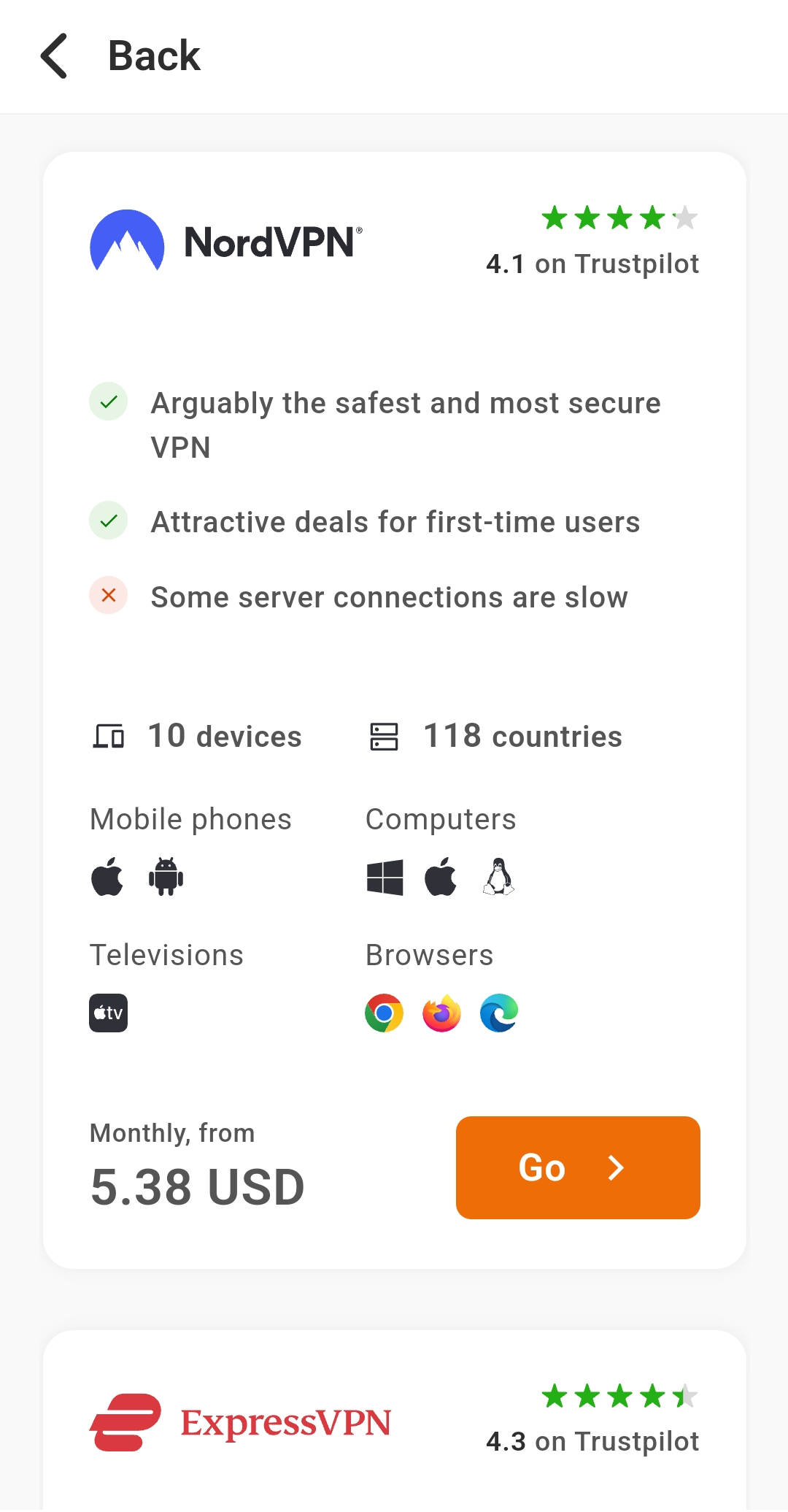
Test: Usability validation
User Testing the Vertical Grid
Before launching, we tested the vertical grid concept through usability tests with high-fidelity prototypes.
Outcome: User response varied by product type:
- Online banking accounts and eSIMs received very positive feedback and curiosity to explore from participants
- Other financial products showed mixed engagement levels
Results: Measurable Impact
Quantitative Success Metrics
Multi-vertical conversions increased from 7.5% to 16.5% (120% improvement)
- This measures how many users converted on multiple products beyond our core money transfer comparison
- 45% of users interacted with at least one vertical tile on the 'For You' page
- Core baseline maintained: International money transfer comparison performance remained stable with no negative impact on our primary product
A/B Testing Validation
A/B testing confirmed the vertical grid increased cross-product engagement.
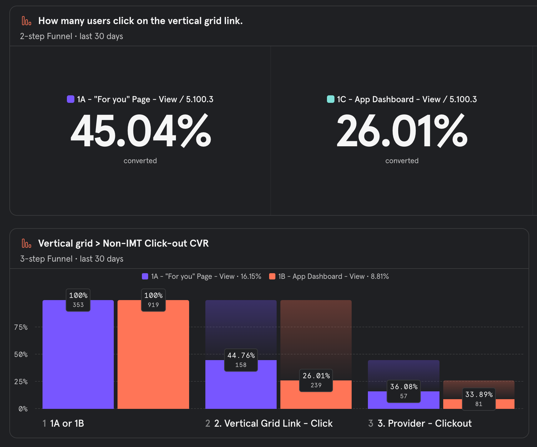
A/B testing results
Speeding up feature developed by my code
I created adaptable HTML components for content comparisons, allowing for:
- Immediate user benefit delivery
- Rapid iteration based on real-time feedback
- Flexible content management across products
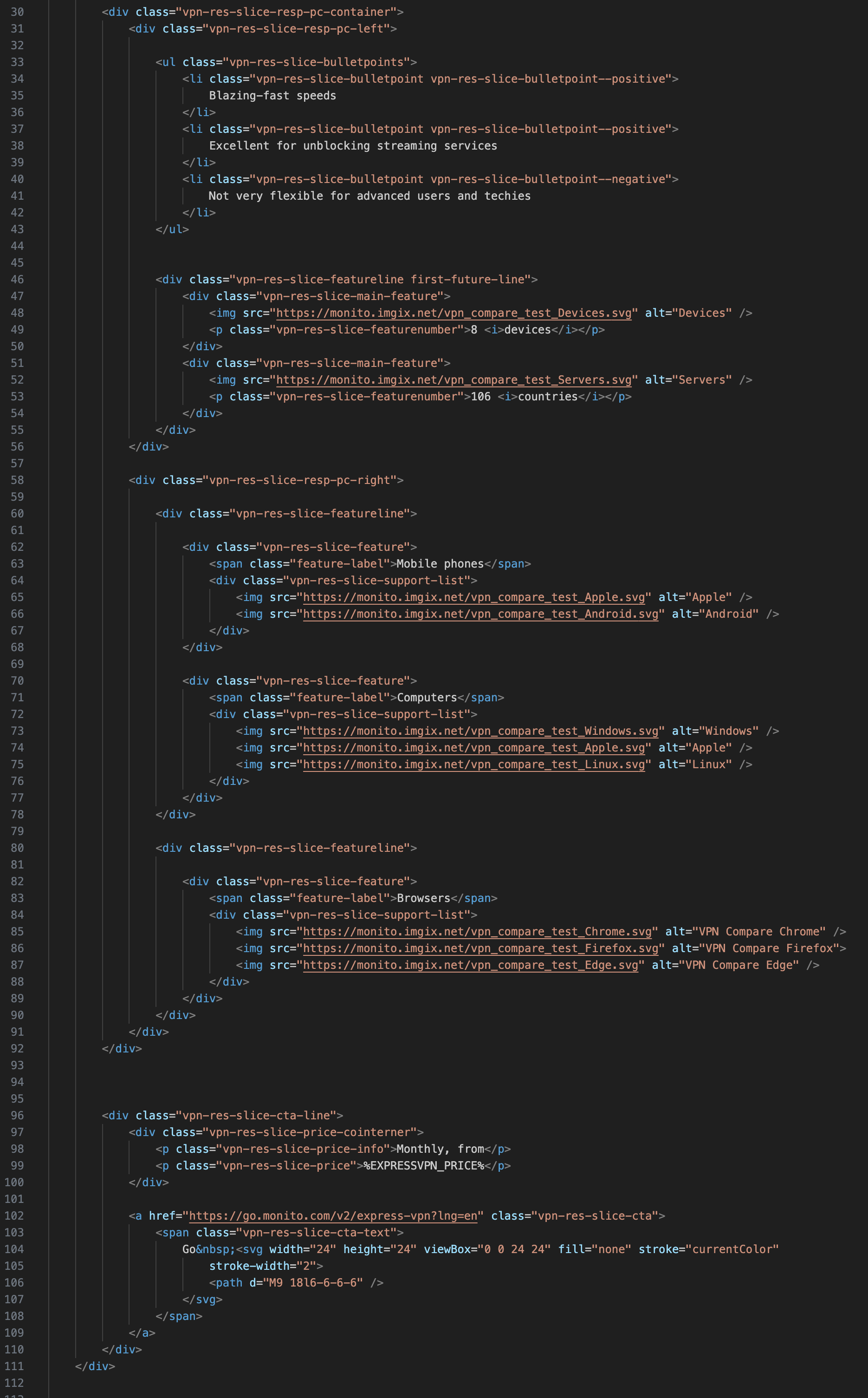
HTML components for quick iteration
Results: Users Love the app! ❤️
The app reached 5.0 score on Google Play and over 100 000 downloads!
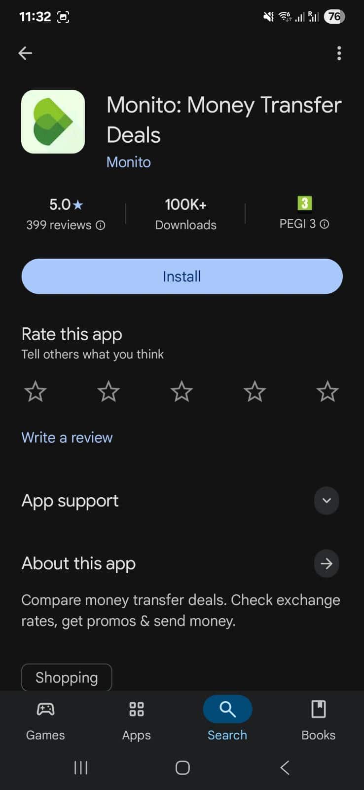
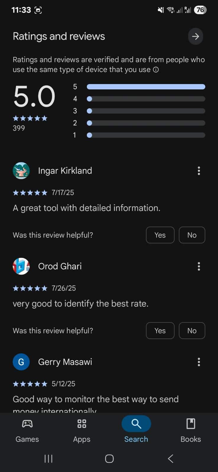
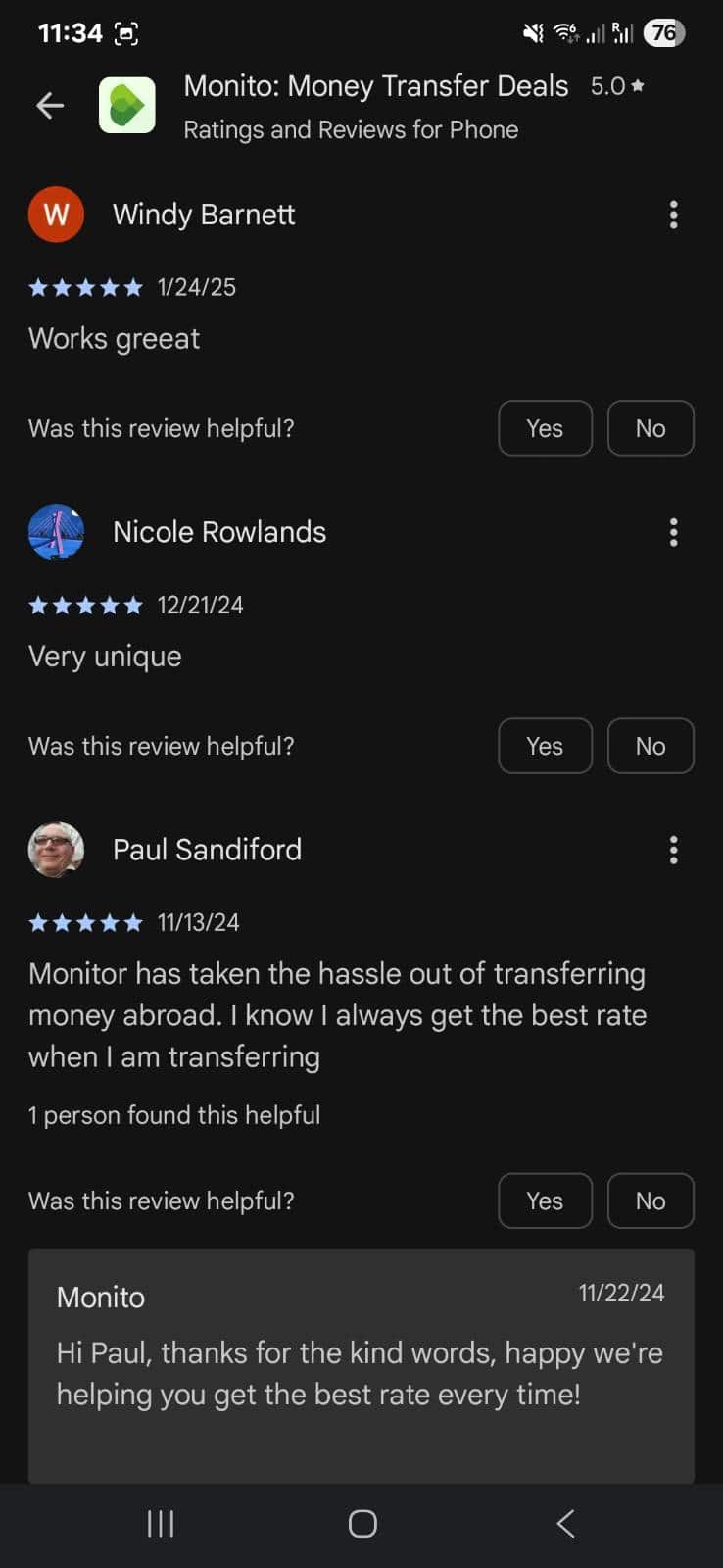
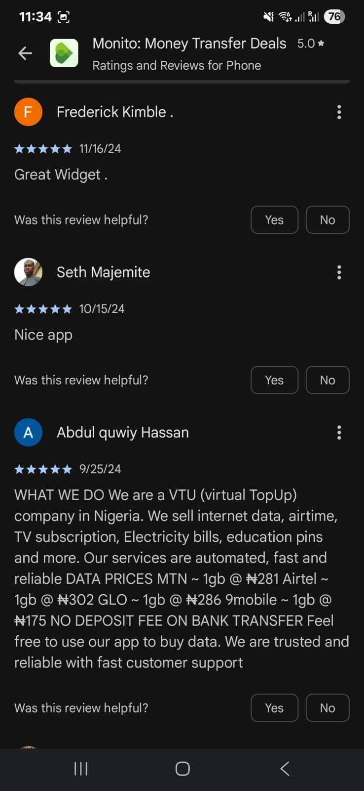
Monito App store listing and rating
Feature planning based on data
We added an item into the vertical grid linked to Typeform for users to tell us what features they wanted. This quantitative research helped us plan what to build next.
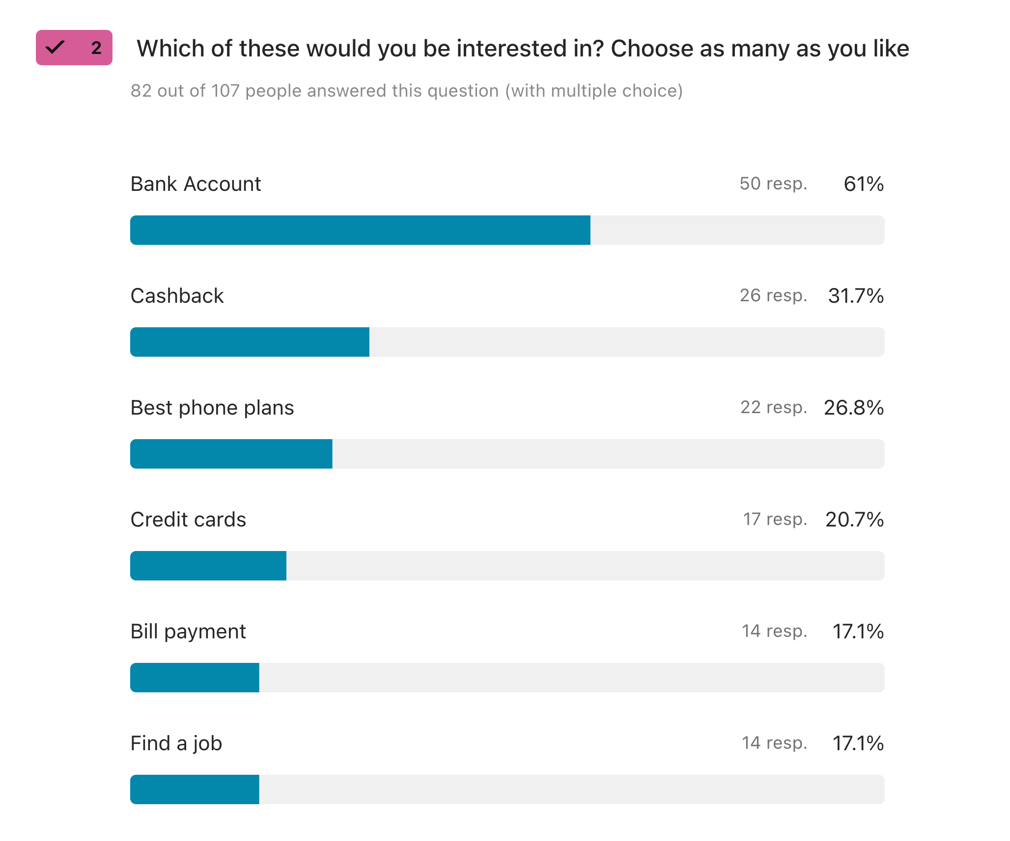
Insights from quantitative surveys
Learnings: Key Insights
- User-Stated Needs vs. Actual Behavior: The social connection feature taught me that while users express a need, how it manifests can be vastly different across demographics, nationalities, and individual preferences.
- Constraints Drive Creative Solutions: Limited development budget forced us to find the most efficient solution (vertical grid) that still delivered user value. Sometimes limitations lead to better outcomes.
- Quantitative Validation Before Investment: The 12% fake-door test click-through gave us concrete confidence to invest in development rather than relying on assumptions.
This project improved user experience while solving real business problems by aligning with genuine user needs.