CARE
For CARE, an innovative preventive healthcare provider, I proposed strategic UX enhancements to significantly improve their digital experience. Through a concise yet insightful UX audit, I clearly identified key opportunities to restructure information architecture, enabling users to better understand and proactively manage their health.
My solution grouped health metrics into intuitive categories rather than presenting isolated data points. This holistic restructuring, combined with simplified UI adjustments, aimed to clearly communicate health insights, empowering users to take informed action.
- March 2025
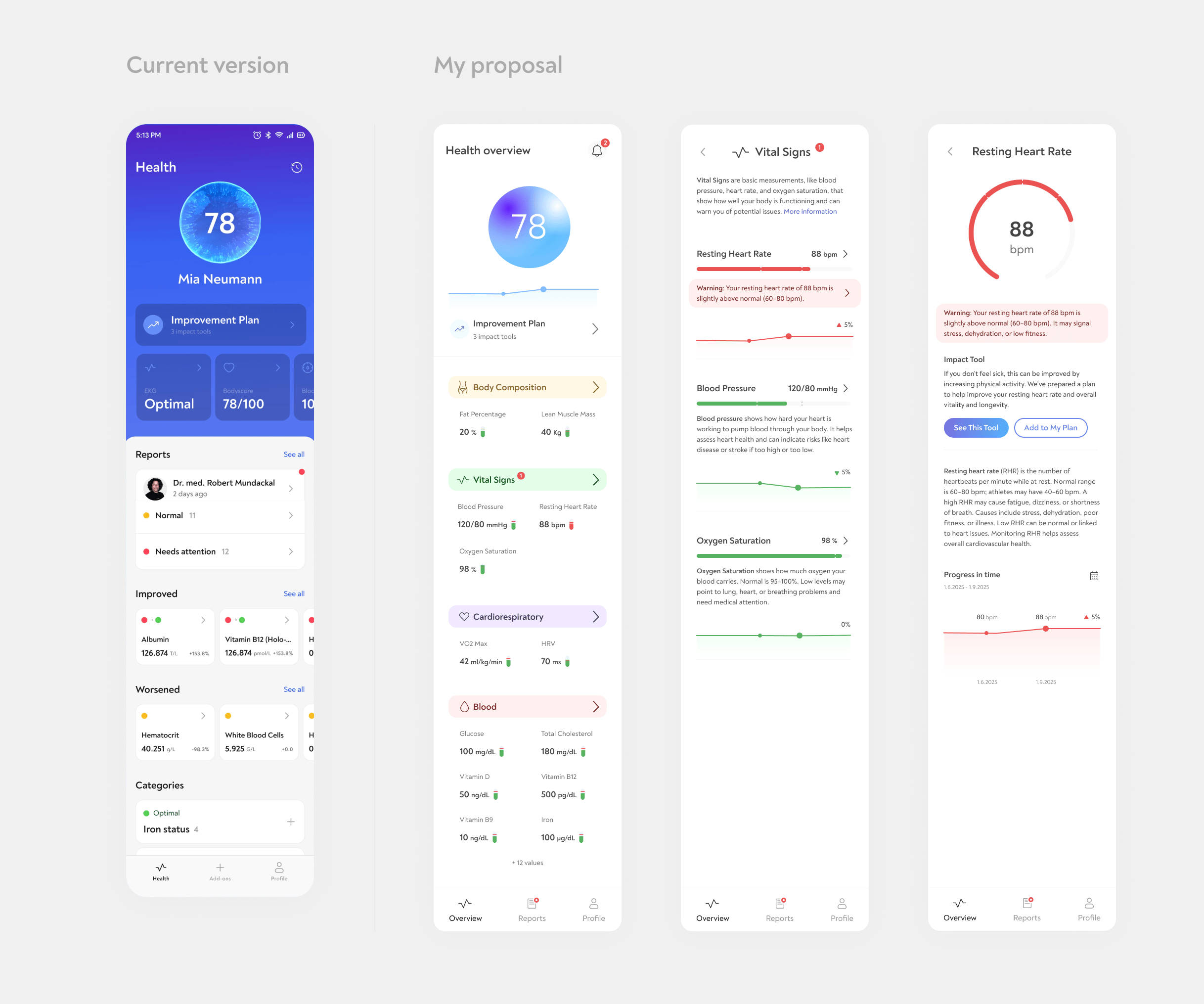
Design proposal for CARE app.
O2 Czech Republic App
Between 2020 and 2021, I led design improvements for the O2 Czech Republic self-care mobile app (Android and iOS). My user-centered design revisions contributed directly to increased user satisfaction, raising the app's ratings by approximately 0.4 points in both App Store and Play Store.
- 2020 - 2021
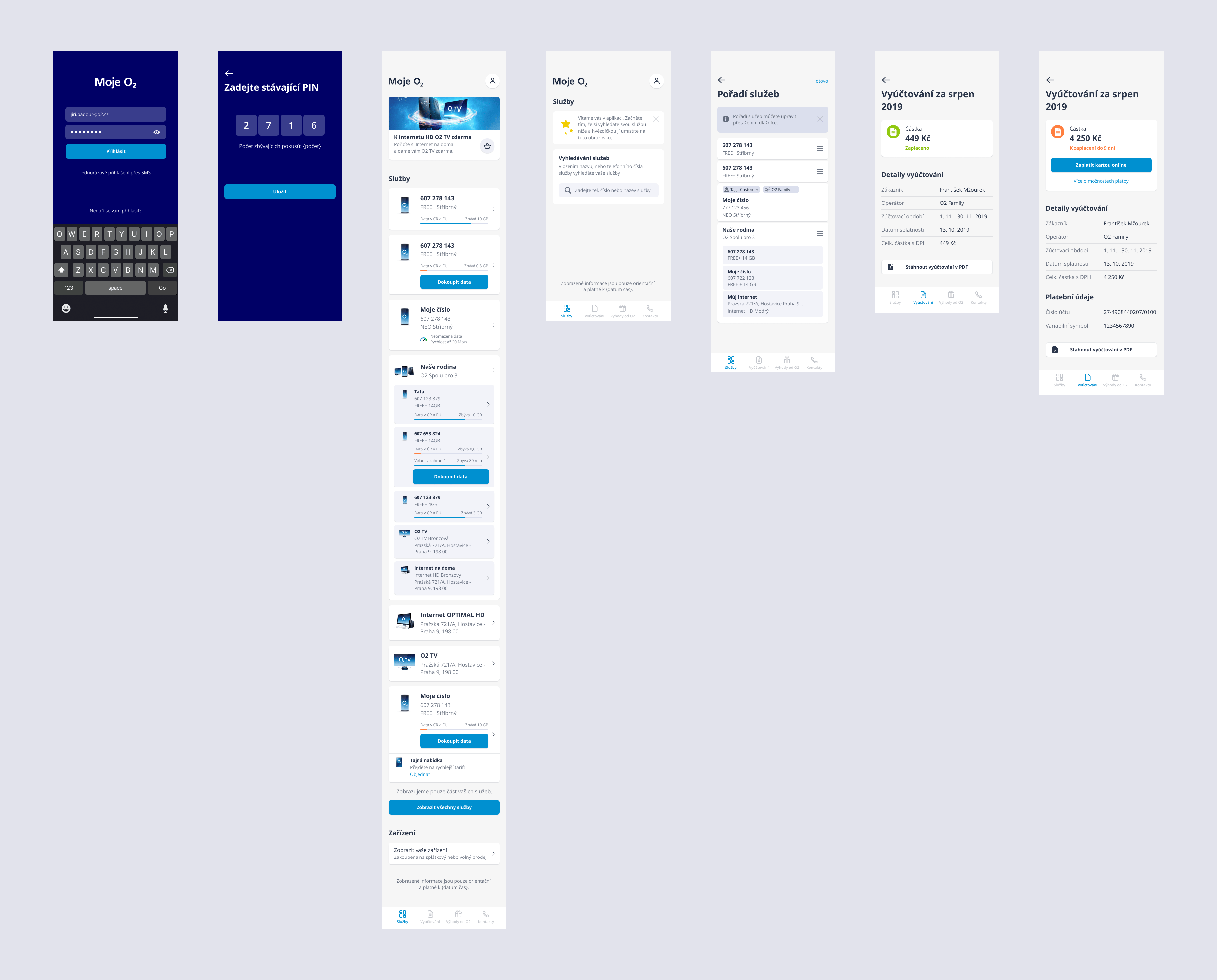
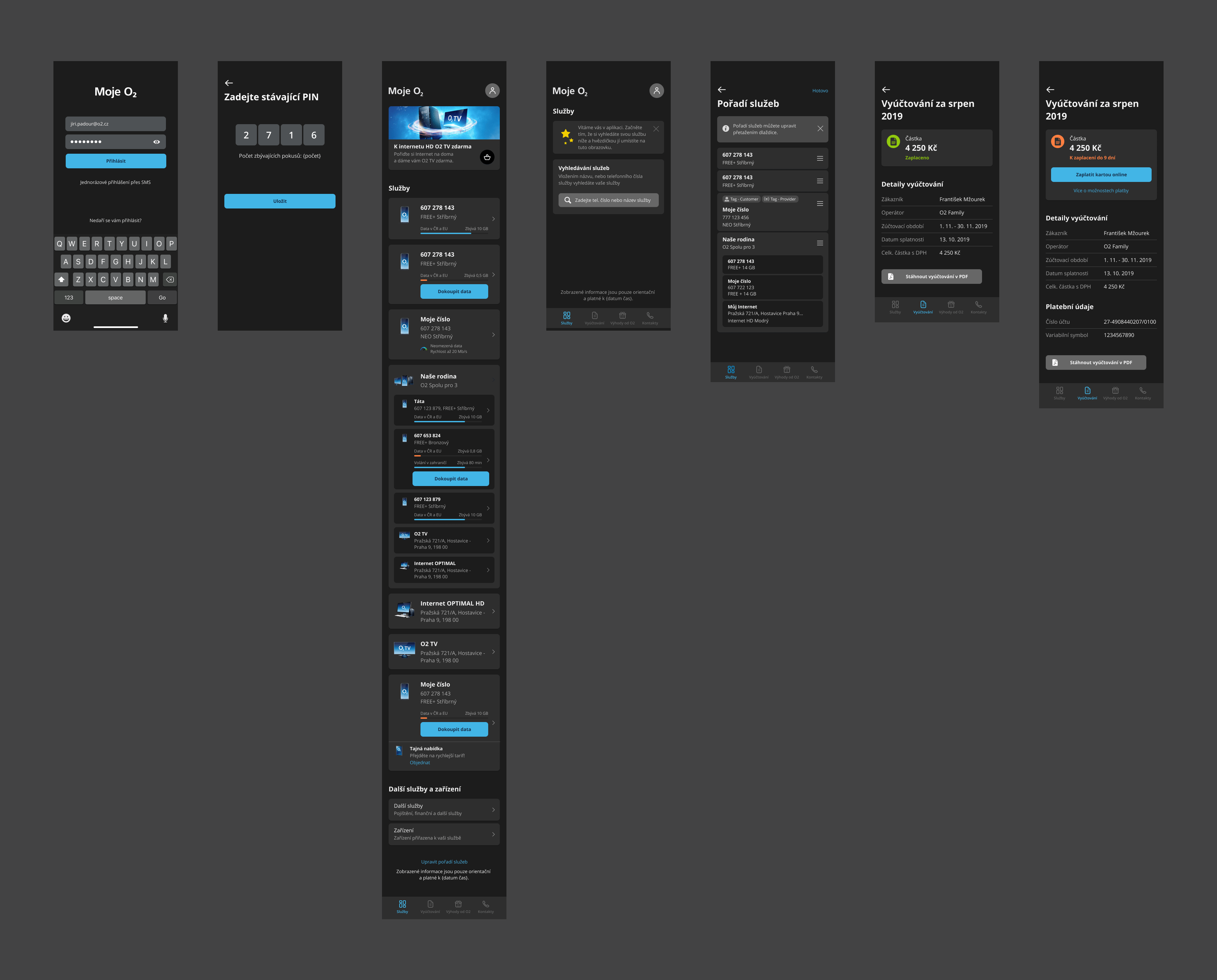
O2 self-care app optimized for clarity and ease of use in both light and dark modes.
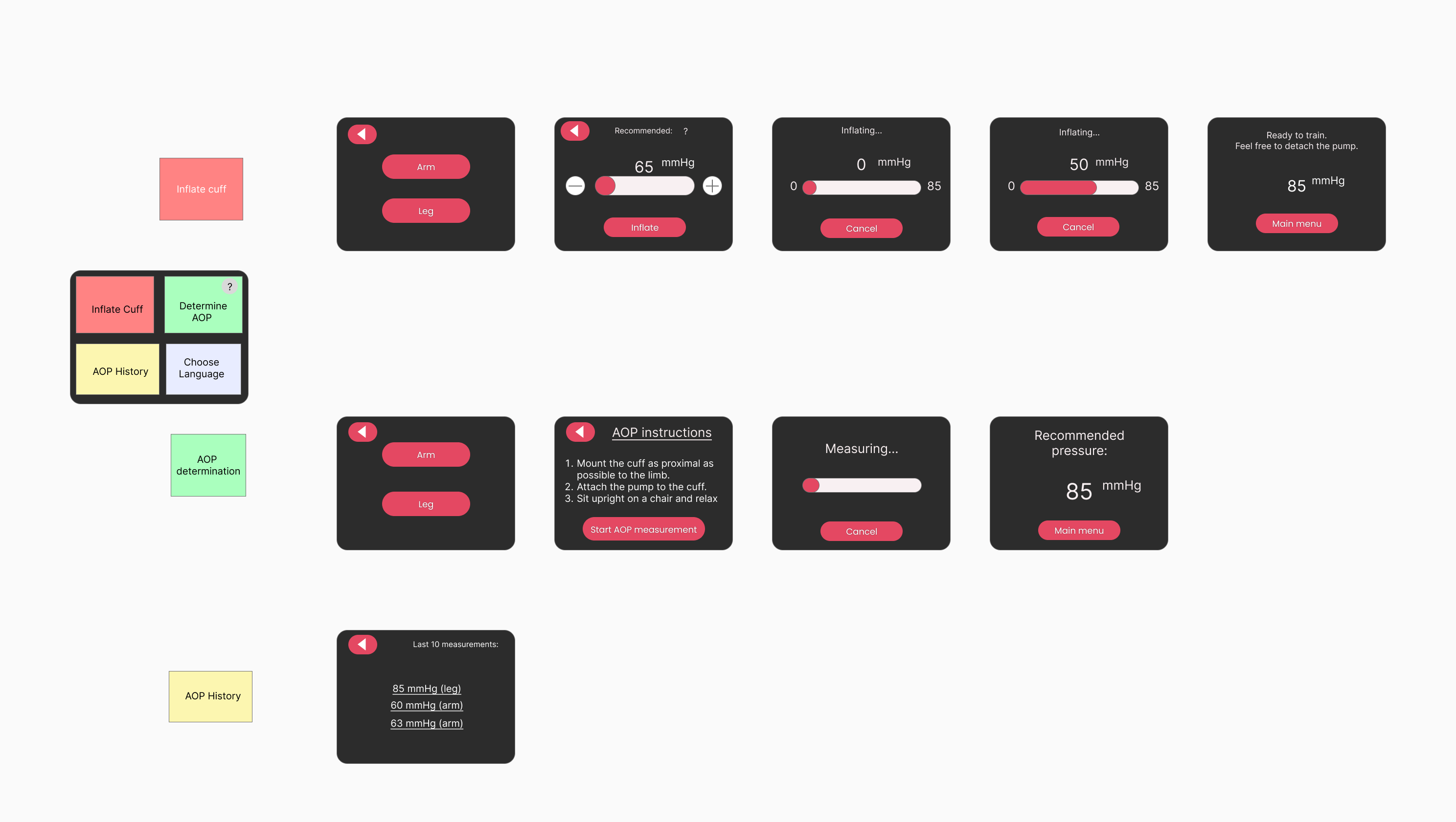
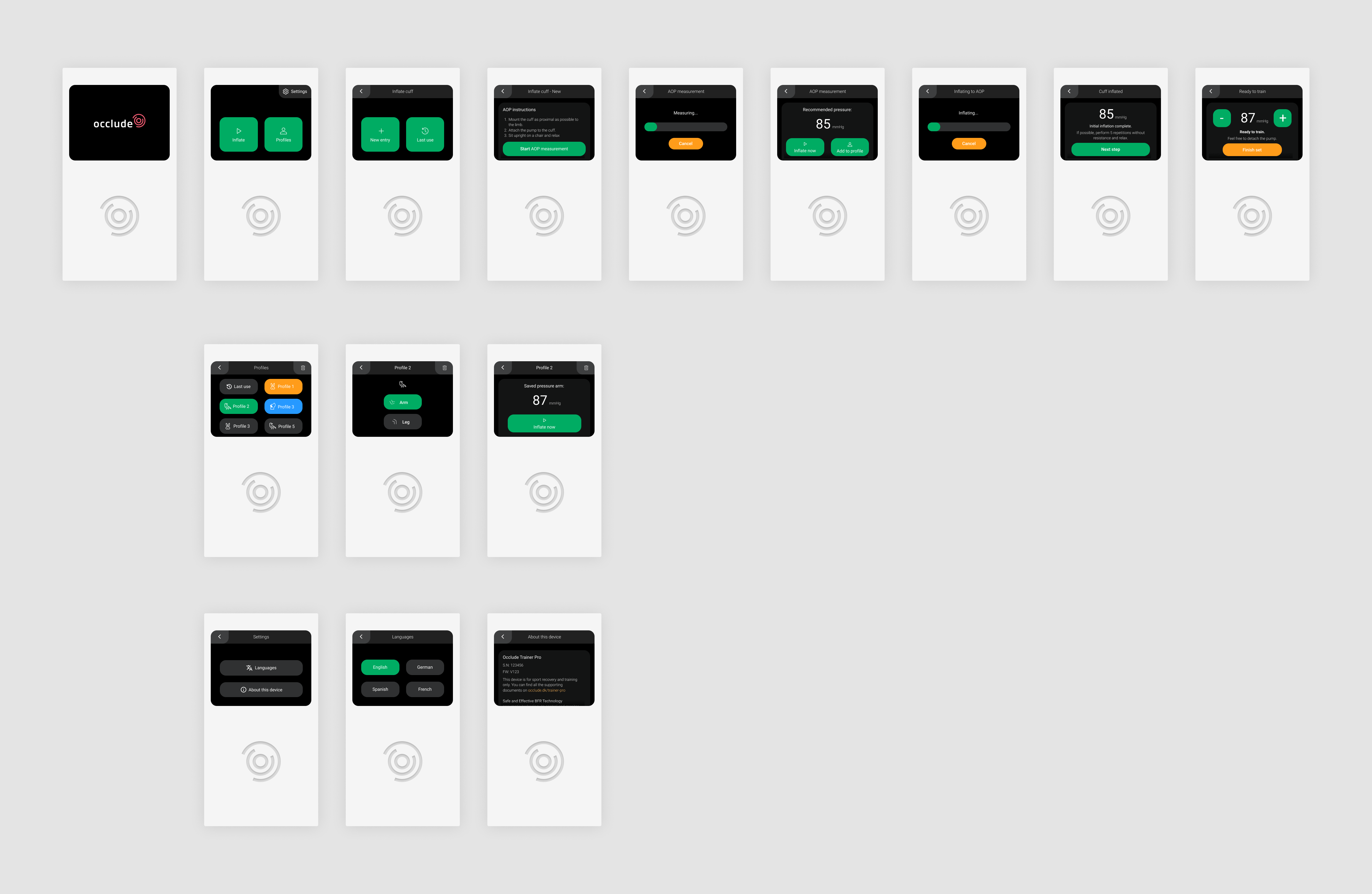
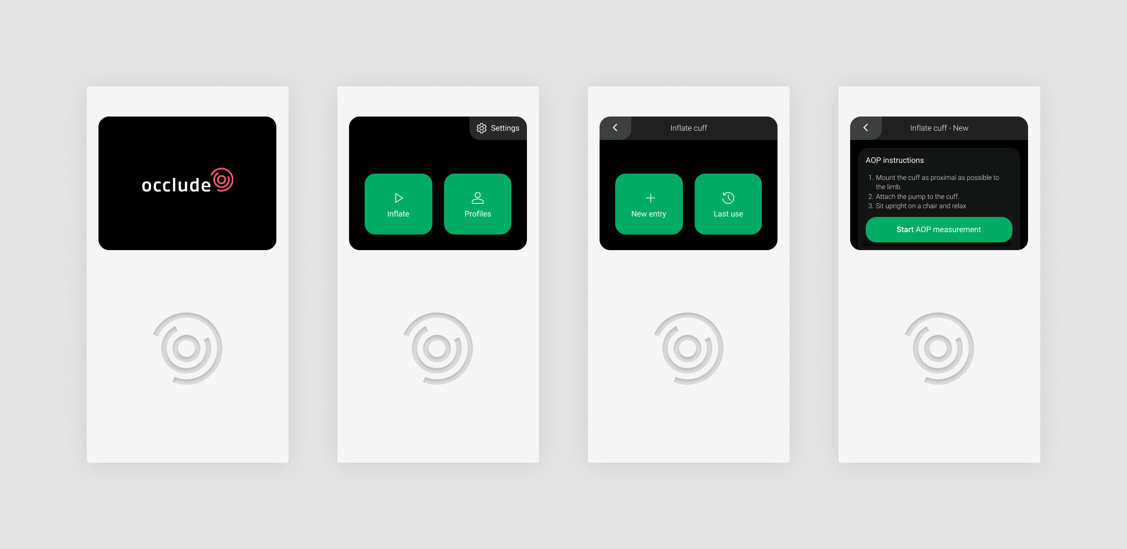
Occlude
For Occlude, a Danish company specializing in blood flow restriction (BFR) training equipment, I designed a user interface for their embedded electronic pump device. This specialized equipment uses a cuff to limit blood flow to targeted muscles during exercise, enabling significant training benefits with lower resistance - particularly valuable for injury rehabilitation.
The project presented unique constraints: a small 320x240 pixel screen, a strict 1MB memory limitation, and hardware that required thoughtful interface design. Without access to extensive user research, I conducted practical research by studying professional BFR training sessions online and employed roleplaying techniques to identify usability issues in the initial design flow.
My solution included several specific UX improvements to address real user needs:
- 2024
The input from Occlude
My design proposal
Despite memory limitations, I incorporated carefully compressed SVG icons (under 10KB) to provide essential visual guidance. For multi-user scenarios, I introduced intuitive animal avatars that allowed users to identify their personal measurement profiles without complex data entry. I also added an accessible "About this device" section providing crucial information and streamlined the most common use case by enabling the system to recall last-used pressure settings for athletes training specific limbs regularly.
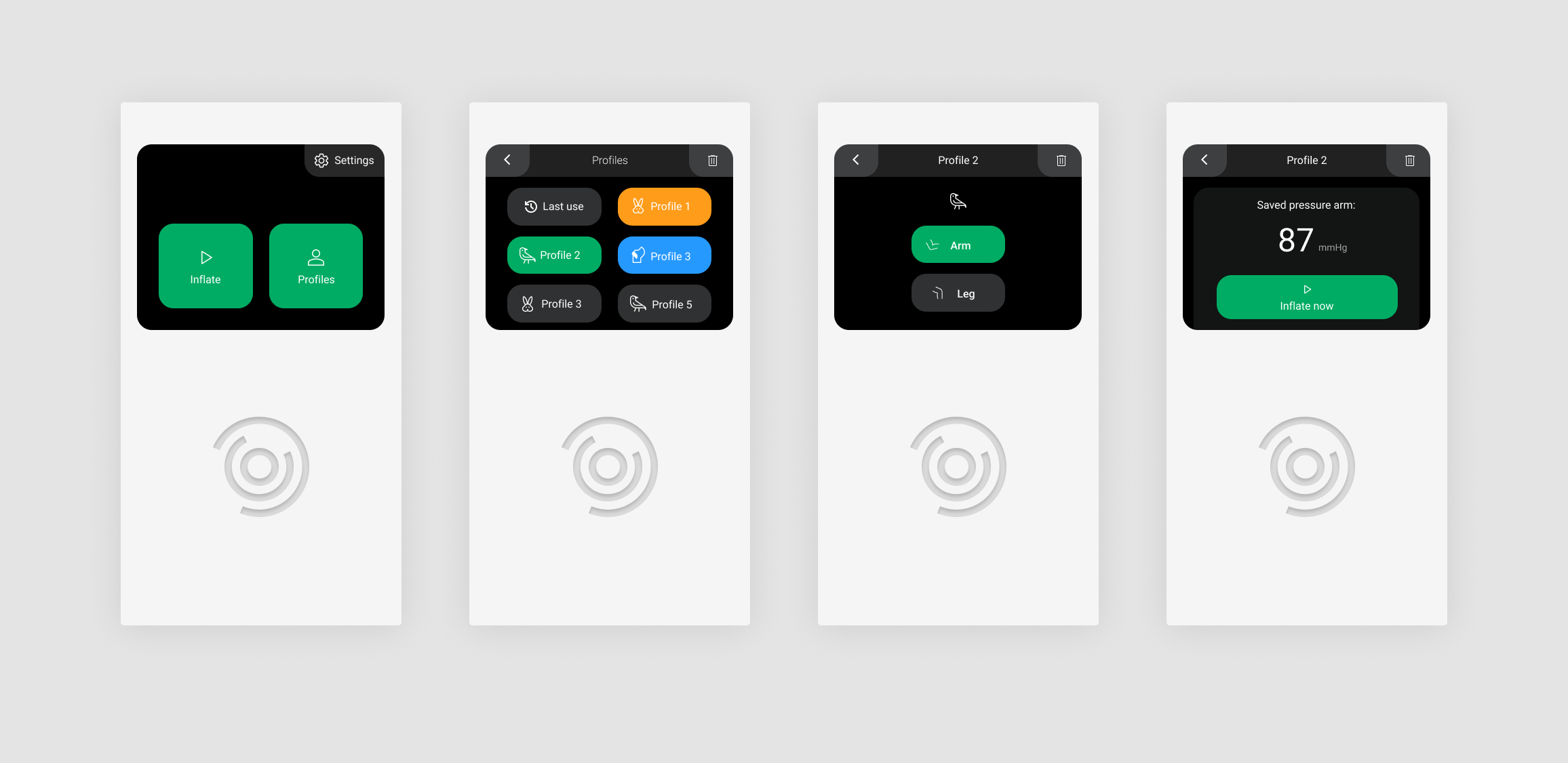
Intuitive measurement history with animal avatars (left) and streamlined workflow for frequent use cases (right).
Invia
For Invia, a leading travel booking platform, I redesigned their quick order modal to address technical limitations while enhancing the overall user experience. The challenge was to remove price displays for certain vacation variants due to backend calculation issues, while simultaneously improving conversion rates.
Through careful analysis of user behavior via Hotjar recordings and heatmaps, I identified several opportunities to optimize the booking flow. The redesign focused on four key improvements:
- Adding social proof elements to build trust
- Clearly communicating what the user is ordering
- Implementing an option to book for multiple participants while maintaining CTA visibility
- Including information about call center response times
- June 2029
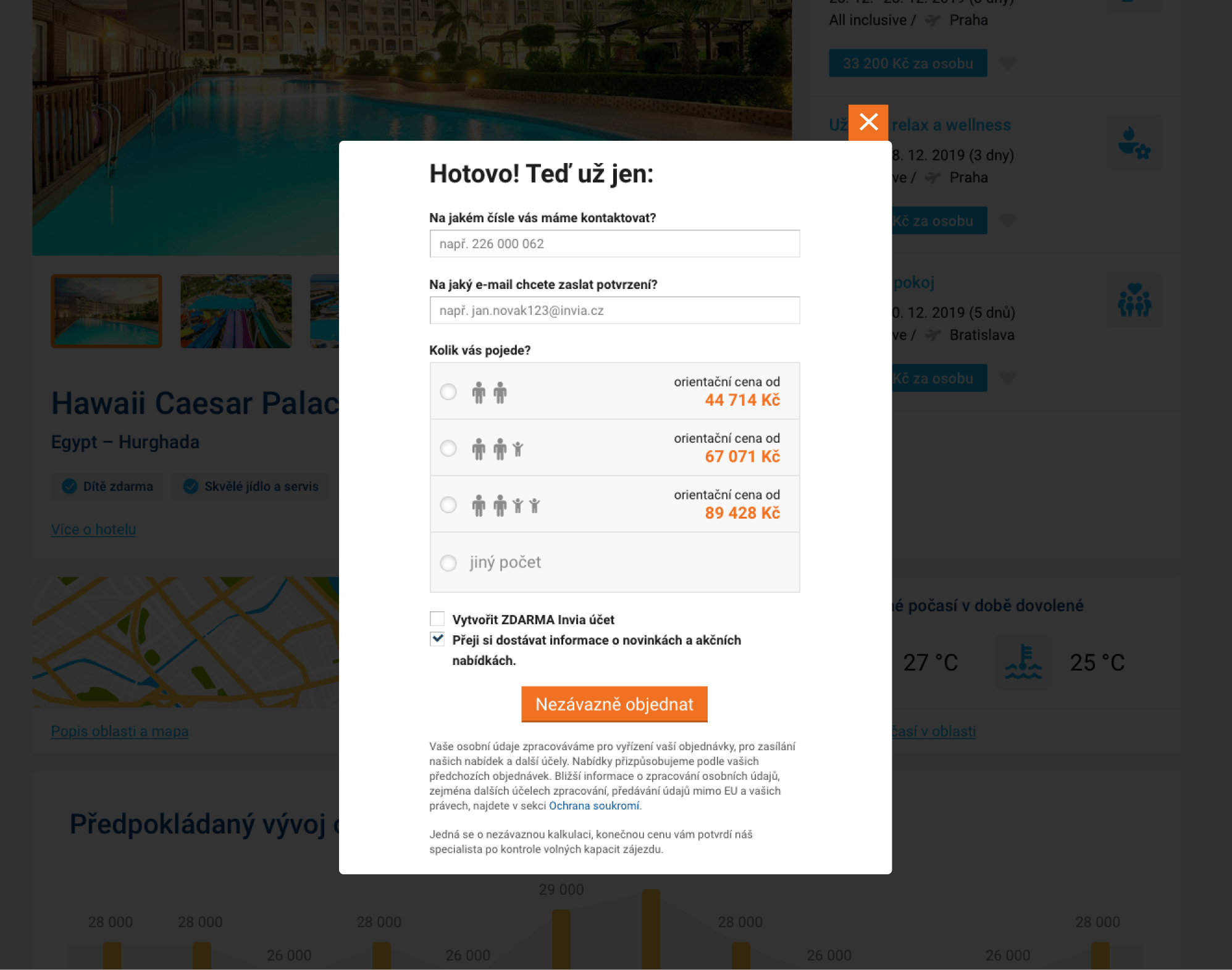
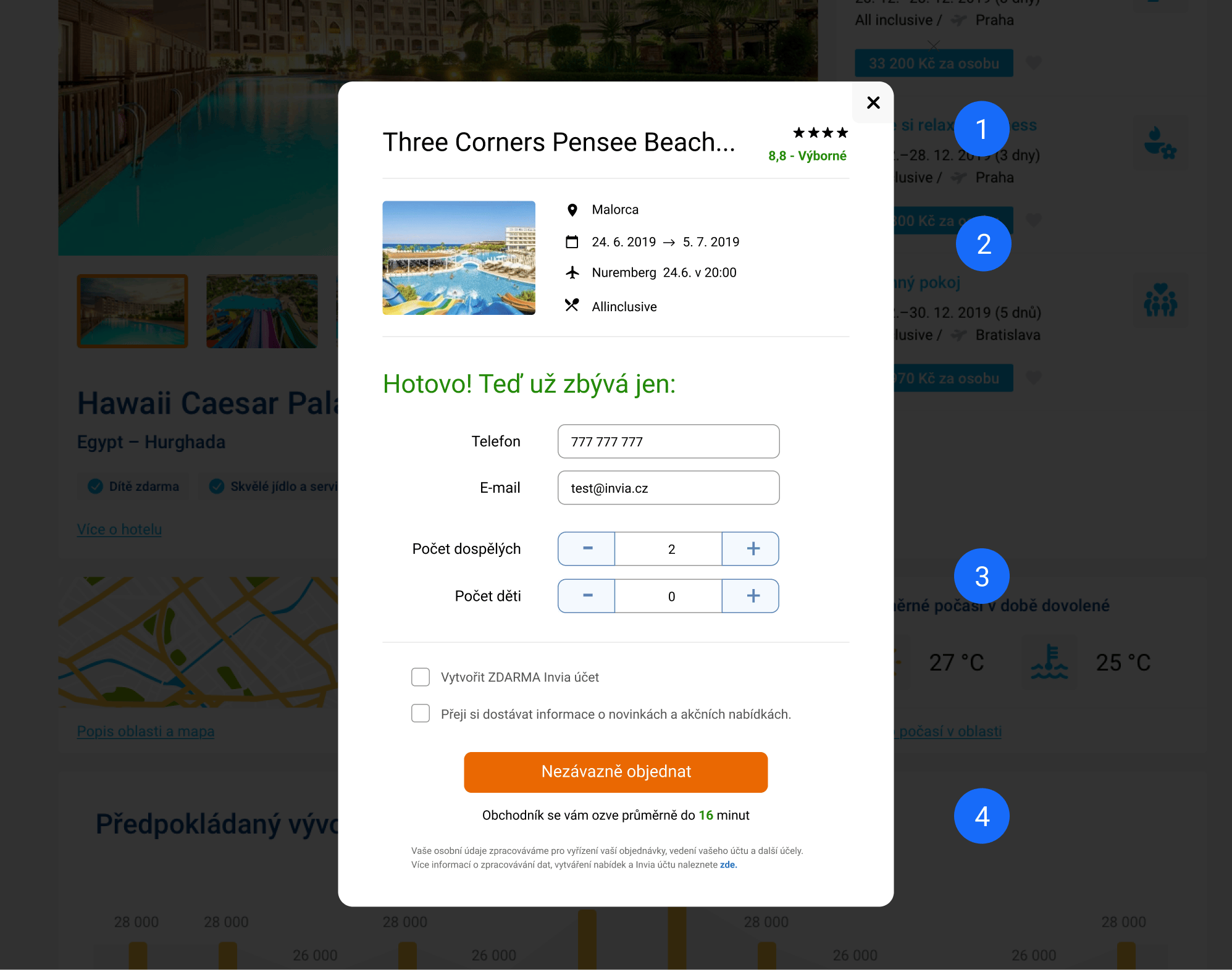
Before and after: Redesigned quick order modal with 4%+ conversion improvement.