Context: Two people, one product
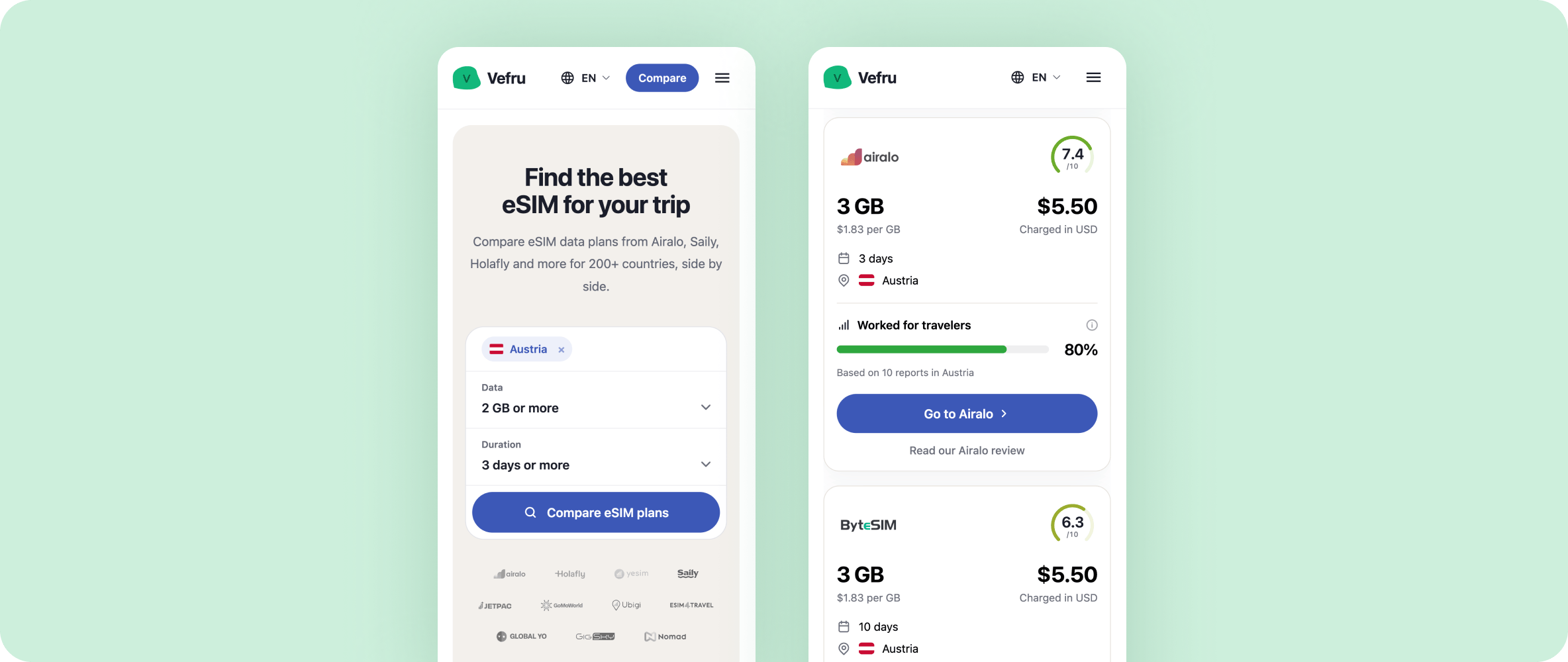
Vefru is a website that compares travel eSIM plans. You say where you are going, how much data you need and for how long, and you see plans from Airalo, Saily, Holafly and other providers side by side. It runs in English, Czech and Polish.
At the end of 2025, my developer friend Frantisek and I decided to build it. The idea was to combine my experience with user-facing comparison products in e-commerce and his technical knowledge. There are two of us, we are self-funded, and we have no budget for paid campaigns.
My part is the product: research, UX, visual design, the design system and the front-end code. AI coding agents generate new UI from a design system I wrote. I refine it by hand in code, and no AI-written UI goes to production without my review.
2
people: Frantisek, a developer, and me
14
providers tested, each with a plan we bought ourselves
3
languages: English, Czech and Polish
Core question
How might we help a traveler pick an eSIM they can trust, when every plan on the list looks the same except for its price?
Research: Testing competitors first
Before we built anything, we ran competitive usability testing: usability tests on the products that already exist. It is a technique from my previous work. You watch people use the competitors' products, you see where they get stuck, and you avoid repeating those mistakes in your own.
Together with user interviews, the tests pointed to three problems.
Three problems people had
Several countries, one trip
People rarely travel to one country only. They wanted to compare plans for every country on their trip at once. This was the biggest problem.
Calls and SMS
Most travel eSIMs are data-only, because that is cheaper and easier for providers. Some people needed calls, SMS and a working phone number.
Which one to choose
Platforms told plans apart mainly by price. People saw a list of providers and prices, with no clear reason to pick one over another.
Price was the only signal
The third problem kept coming back in interviews and in tests. Paying $0.50 more can be worth it if the eSIM installs easily, connects right away and somebody answers when it doesn't. A cheaper plan can mean a failed installation, a poor connection or nobody to ask for help. People could not see any of that. On some platforms, two plans from the same provider had different prices and nothing explained what made them different.
What we took from it
The lists were easy enough to read. They did not say what people needed to know to decide.
Design: From a price list to a decision
Several countries in one search
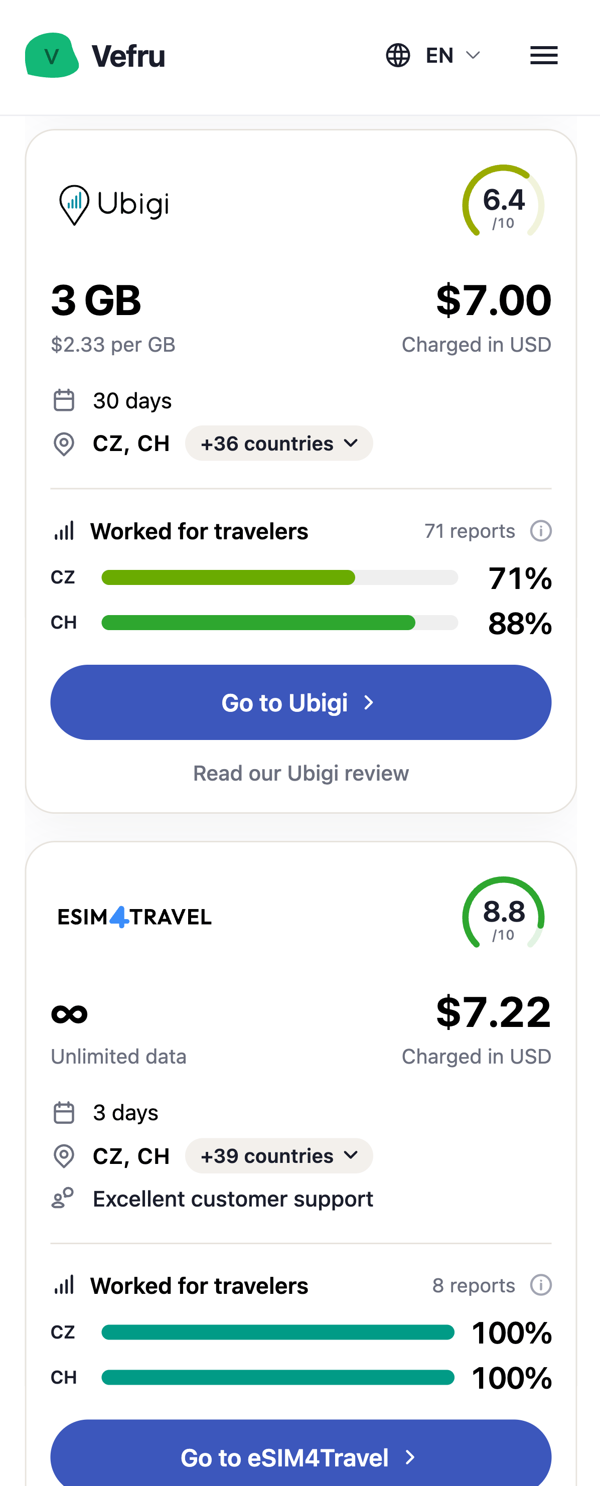
Searching and comparing across several countries was more of a technical problem than a UX one, and we solved it. You add every country of your trip to the search, and each plan shows which of them it covers.
Calls and SMS as a filter
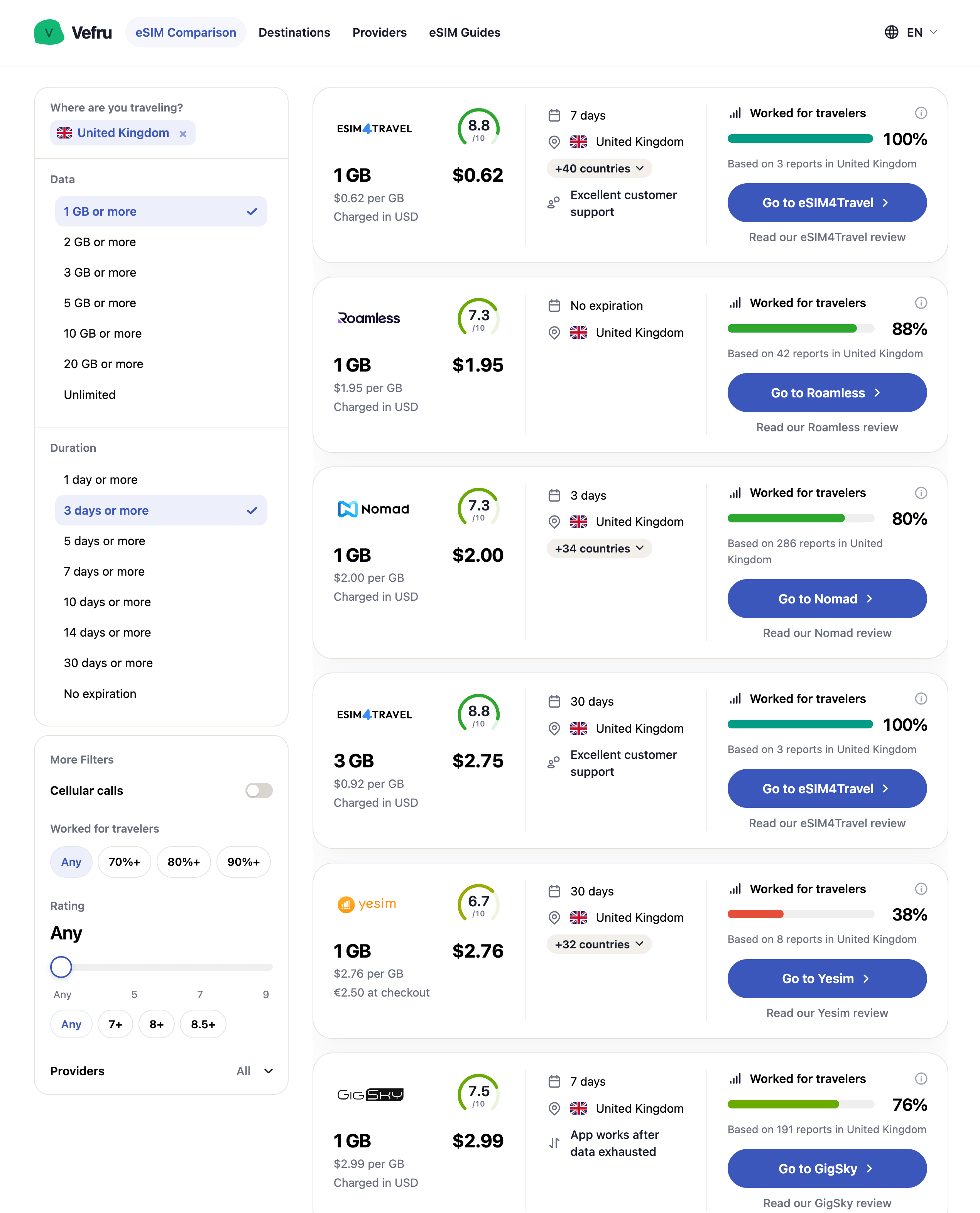
Plans with calls and SMS were the easier part: a Cellular calls switch in the filters, next to data, duration, rating and providers.
We tested every provider ourselves
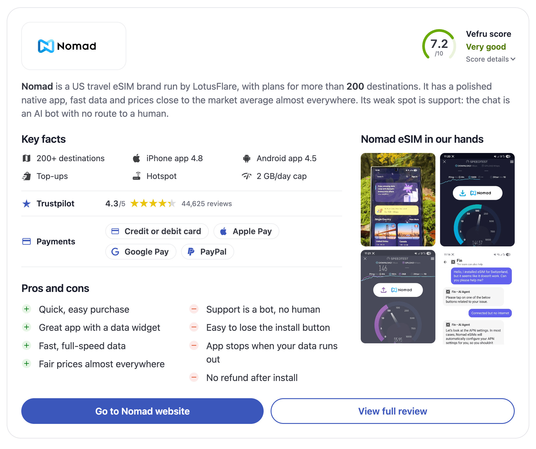
Helping people choose took far more work. First, we tested an eSIM from every provider on Vefru ourselves, to learn where each one is strong and where it is weak. We buy the plan, install it, run speed tests and contact the help desk. The provider cards show it: our own photos, speed tests and chats with the help desk sit next to the facts.
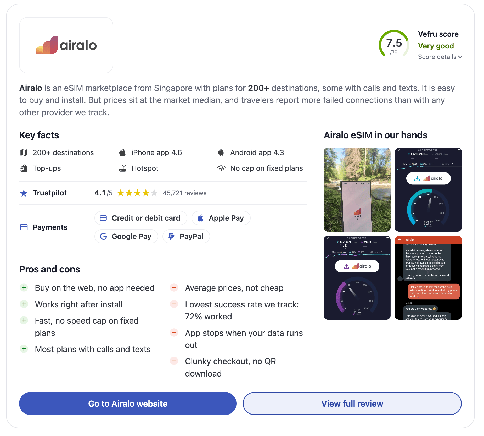
Reasons to choose, on the plan itself
From that testing we wrote down what sets each provider apart and put it right on the plan: an app that can make calls, very good customer care, or an app in a language Vefru runs in. Czech is a good example. Few eSIM providers have an app in Czech, so for a Czech traveler it is a real reason to choose one.
Does it work where I am going?
We wanted to give people more than that, so we collected all the data available on how each provider performs in each country. In our usability tests this was the strongest differentiator: it made plans easy to tell apart, and people felt confident about their choice. Every plan now shows a Worked for travelers rate for each country in the search.
A plan card now answers three questions:
What do I get, and for how much?
Data, days, the total price, the price per GB and the currency you are charged in.
Is the provider any good?
A Vefru score from 0 to 10: the average of eight categories, five of them our own hands-on tests.
Will it work where I am going?
The share of traveler reports that said it worked, country by country.
How much data is behind a number
100% from 3 reports is weaker evidence than 80% from 286. So the number of reports sits with every rate, small samples get a Too few reports label, and on the map a country with fewer than 3 reports is drawn in a lighter shade.
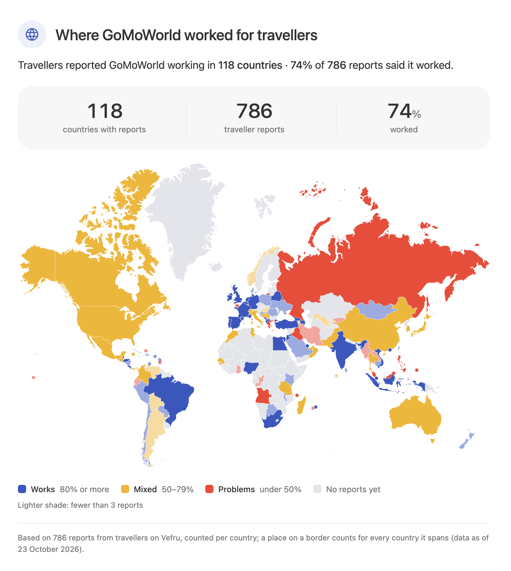
What a traveler sees
Trip
Hard to compare plans for a trip across several countries
Every country of the trip in one search
Calls and SMS
Mostly data-only plans, hard to find one with a phone number
A Cellular calls filter
Choice
Plans told apart mainly by price
A score, the provider's strengths and a success rate per country on each plan
Content: Pages for organic traffic
With no budget for paid search, we have been building the website around organic traffic from the beginning. That means a lot of content pages: destinations, providers and how-to articles.
We made reusable content blocks that present each provider and each destination clearly and in the same way on every page. The provider cards and the map above are two of them.
The answer goes first
One decision is worth pointing out: the summary and our recommendation sit at the top of the page, not somewhere further down. SEO matters to us, but when the two pull in different directions, the reader comes first.
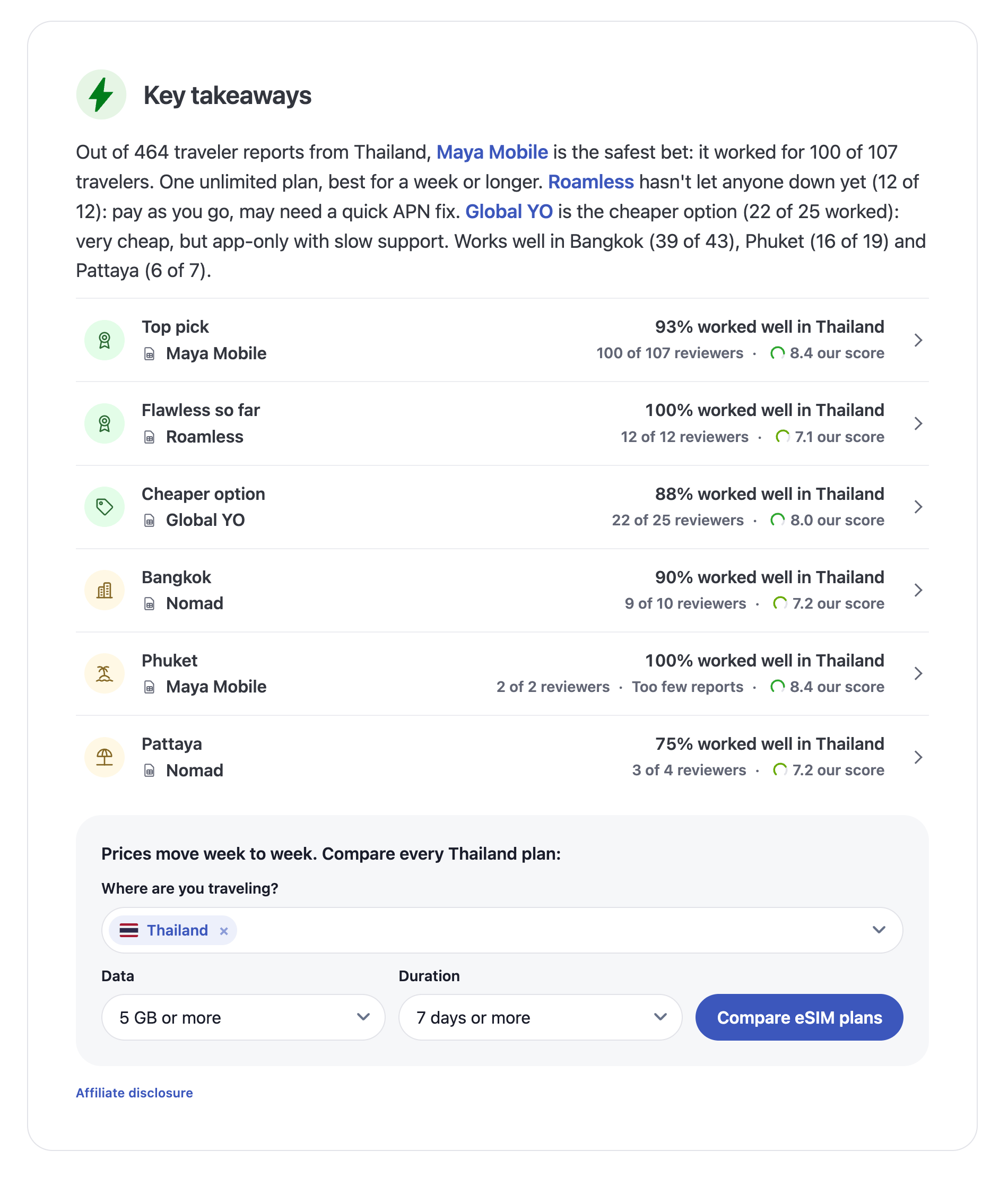
On the Thailand page, the first block names a top pick, a cheaper option and the best choice for Bangkok, Phuket and Pattaya, each with the traveler reports behind it. The search form is right below, for anyone who wants to see every plan.
Design system: Written for AI agents
I designed the first components in Figma and iterated on them as the product grew. In that period we focused on shipping fast, and the website needed to be brought back into alignment. As the number of components and features grew, the work moved gradually from Figma to a design system in code, created with Claude Code.
It covers the whole website and it is what the AI agents build from. It has three layers:
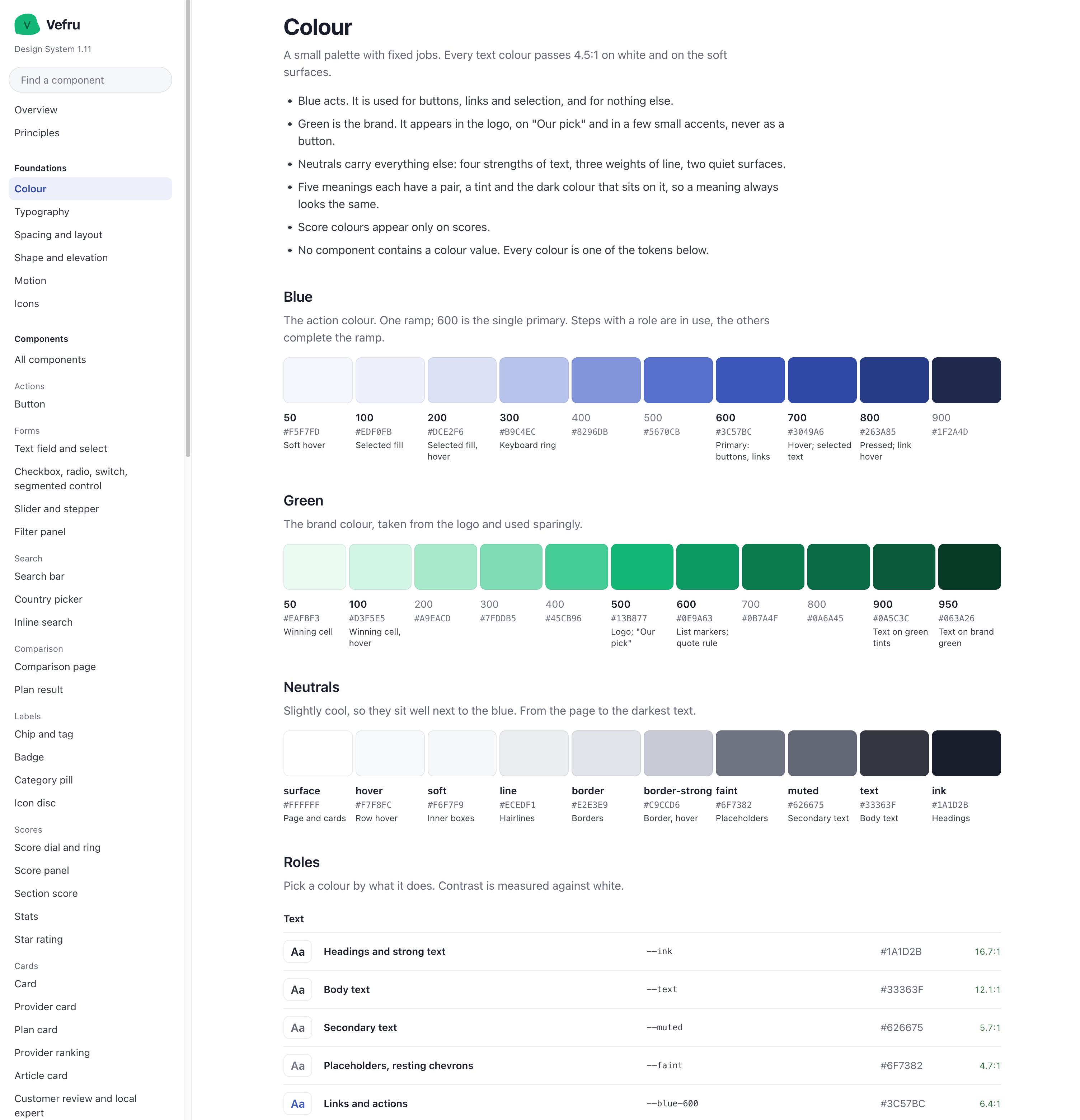
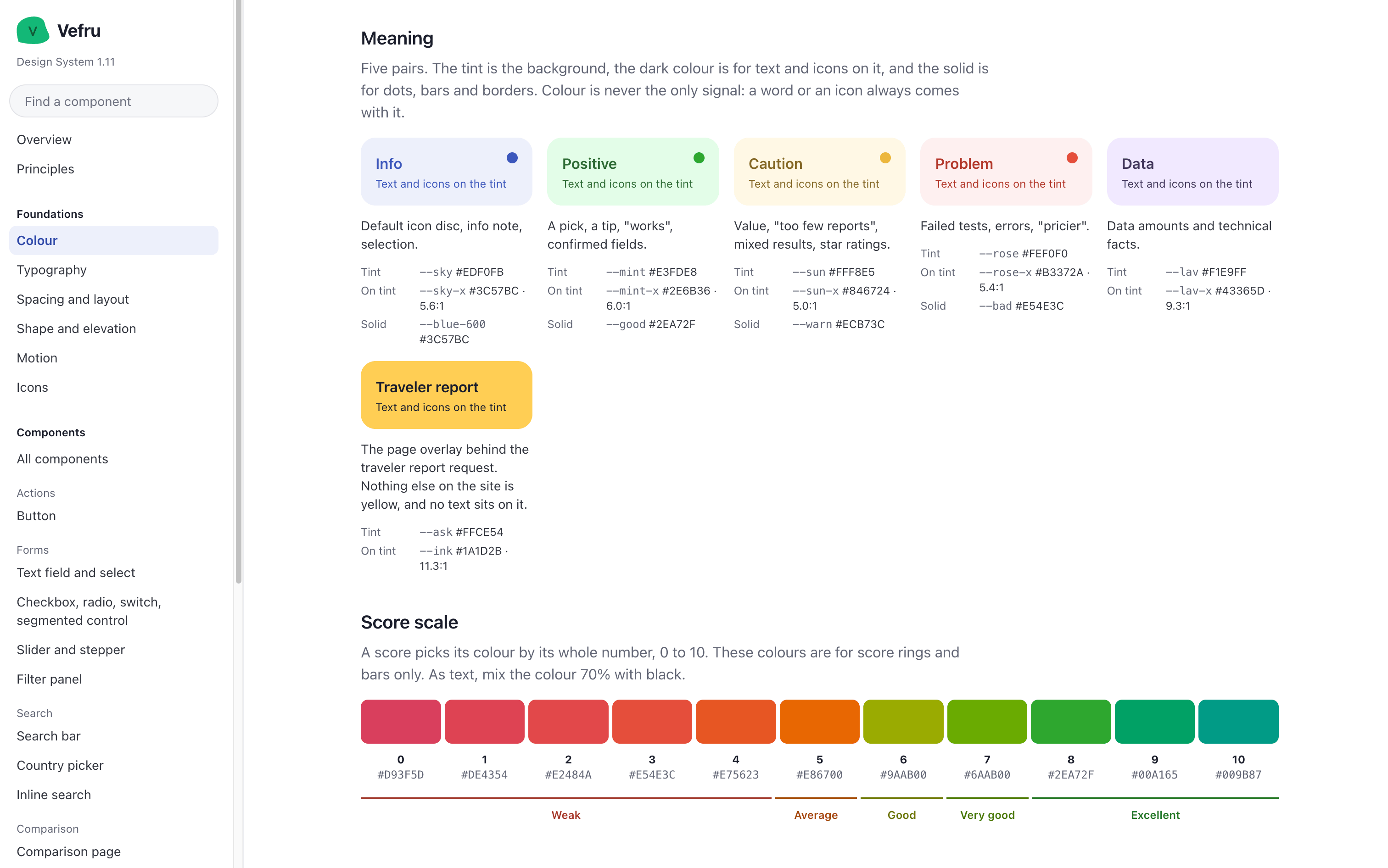
- Tokens for color, typography, spacing, elevation, motion and icons.
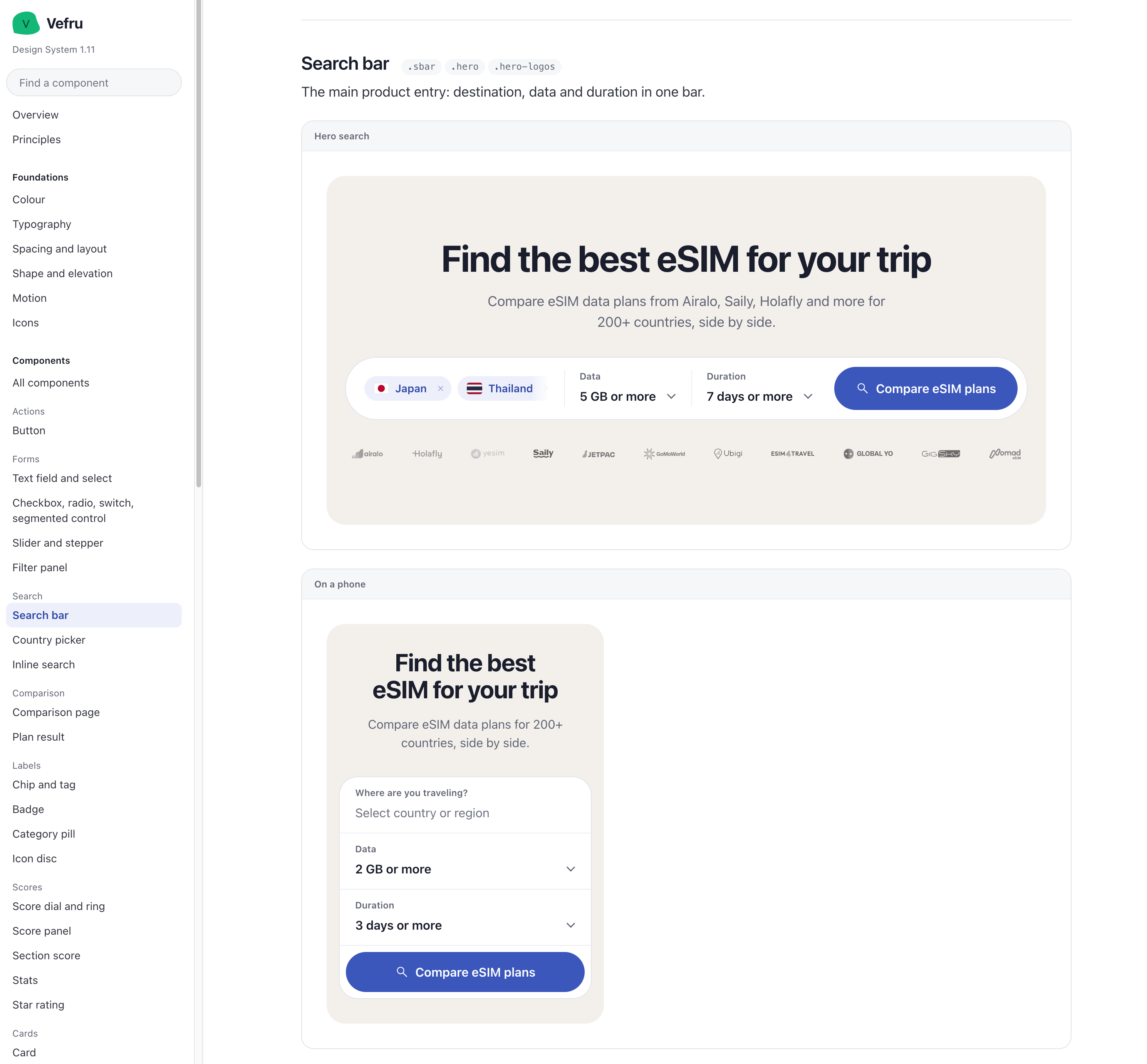
- Components, grouped by the job they do: actions, forms, search, comparison, labels, scores and cards. Each one is listed with its class names, a one-line purpose and its variants on desktop and on a phone.
- Rules, written as plain sentences that a person or an agent can follow.
Rules an agent can follow
A hex value tells an agent what a color is. A rule tells it when to use it. A few rules from the Colour page:
- "Blue acts. It is used for buttons, links and selection, and for nothing else."
- "Green is the brand. It appears in the logo, on 'Our pick' and in a few small accents, never as a button."
- "No component contains a colour value. Every colour is one of the tokens below."
- "Colour is never the only signal: a word or an icon always comes with it."
1.11
current version of the design system
4.5:1
contrast that every text color passes, on white and on the soft surfaces
0
hard-coded color values: every color is a token
From the system to production
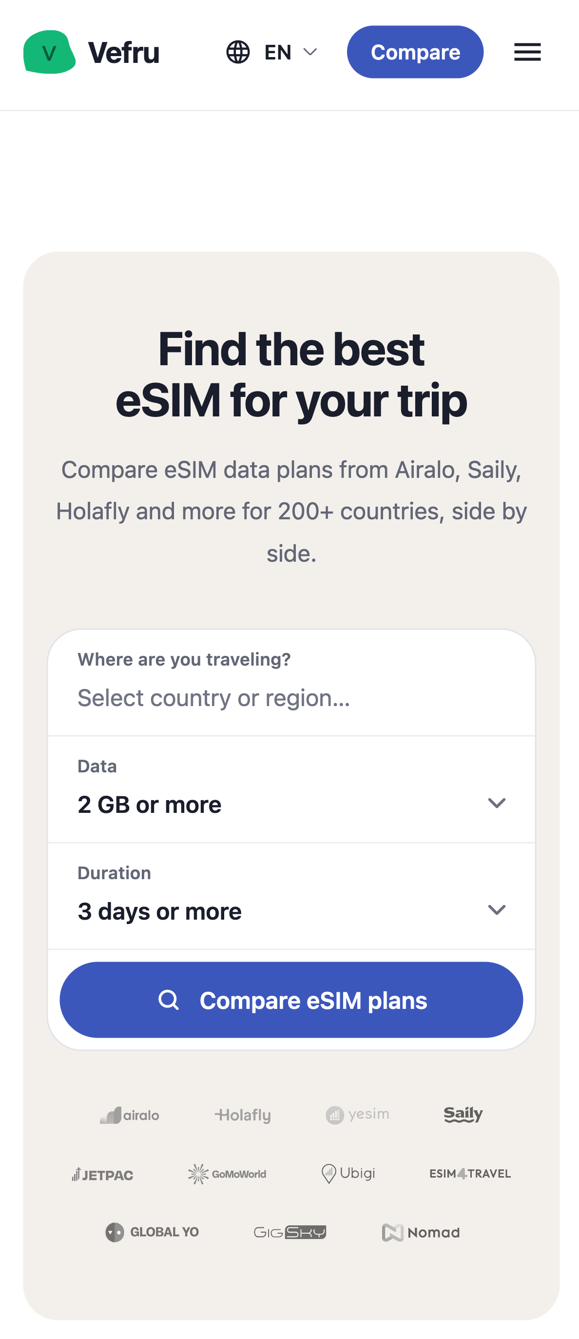
With a library of components that already follow the system, a new component that fits the rest of the website is much easier to get, whether I write it or an agent does. The search bar is a good example: documented once for desktop and for a phone, and live on the homepage in the same form.
Workflow: AI writes, I review
The website has a hybrid setup: it is built around Vercel and connected to a CMS. We own the code and have full control over it, but not everything has to be written directly in the codebase. UI reaches the website in two ways.
Through the CMS
Content blocks, search forms and similar elements. AI generates the code, I review it and edit what is needed, and I publish it as a component in the CMS. This is how I iterate fast.
Through the pipeline
Work that touches the whole website. The design system is used to generate precise GitLab issues, an AI agent works on them, and the result comes back as a pull request.
The pipeline
This is not vibe coding. AI makes the build faster, but the process is the traditional one, with code reviews and controlled deployments. When an agent delivers a solution, I go through it in a pull request and decide whether the code is good enough. When the output is close but not right, I refine it by hand in code. Once approved, it goes to pre-production and then to production.
The quality gate
Automated tests run first. Then I review the pull request and the visual result. Nothing AI-written is released before both are done.
Results: Honest numbers at low traffic
Vefru is at the beginning of its organic growth curve, and organic traffic takes time to build. We already measure what we can: bounce rate and conversion rate, which for us is the share of visitors who click out to a partner.
15%
of visitors click out to a partner so far, and it differs from page to page
A few
organic visitors per day, so every single visit moves the numbers
The 15% is an early signal, and I don't read it as a result yet. With a few organic visitors a day, every visit and every clickout has a visible effect on the numbers. That is not enough traffic for a proper A/B test or for reliable conclusions from quantitative data.
So the tracking is in place, the website is prepared for A/B tests and other experiments, and until the traffic is there, qualitative research leads our decisions.
Learnings
Test the competitors first
Usability tests on existing products showed us their mistakes early, before we had built anything of our own.
Evidence beats a price list
Price alone did not help people decide. Our own tests and the traveler data for each country gave them a reason to trust a plan.
AI needs a system and a gate
Agents build consistent UI when they work from tokens and written rules. A review of every pull request keeps the quality in my hands.
Vefru is live at vefru.com.